Recovery Factor Calculation for Smart Traders
Master the recovery factor calculation to measure a strategy's resilience. Learn the formula, see DeFi examples, and find top wallets with Wallet Finder.ai.

June 20, 2026


Wallet Finder
January 8, 2026

A crypto bubble map is a powerful data visualization tool that shows you exactly who owns a token and how they're all connected. Think of it this way: large bubbles represent the major players or "whales," while the smaller ones are everyday retail investors. This gives you an instant snapshot of a token's power structure and centralization.
Imagine trying to figure out a city's economy by sifting through endless spreadsheets of financial records. It would be a nightmare.
Now, what if you had a visual map instead? On this map, skyscrapers represent massive corporations, office buildings are mid-sized businesses, and small houses are individual residents. That's precisely what a crypto bubble map does for a token's entire ecosystem. It turns raw, confusing blockchain data into an intuitive, interactive picture, saving you from manually digging through transactions on a block explorer.
This visual approach is a massive step up from traditional on-chain analysis. The 2017 crypto bull run and the brutal 2018 crash taught traders a harsh lesson about volatility. When Bitcoin’s price plunged 45% in just five days, investors with the right tools saw the writing on the wall by tracking large holder movements. They got out before the panic set in.
At its core, a bubble map is built to answer three crucial questions in a heartbeat: Who's holding the tokens? How much do they have? And how are they connected to each other?
Here’s a great example of what a typical bubble map looks like in action.
The image above clearly shows different clusters and individual bubbles, which immediately tells you how a specific token is distributed among its biggest holders.
To really get it, you just need to know the key parts:
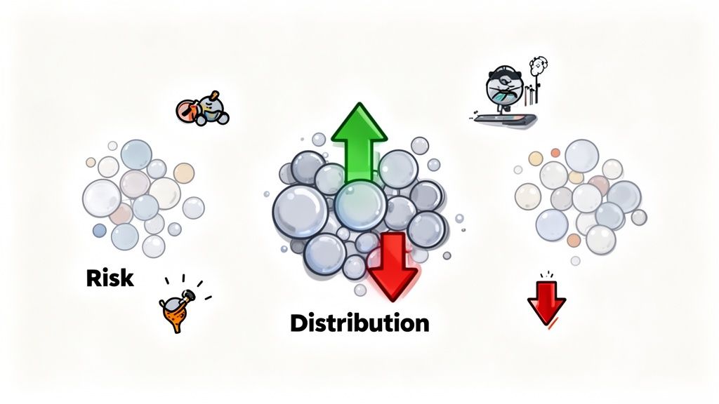
This simple visual language makes complex tokenomics easy to understand. For instance, a map with one massive central bubble connected to tons of smaller ones signals a major centralization risk. On the other hand, a map with lots of medium-sized, unconnected bubbles suggests a much healthier and more decentralized distribution.
To make this even clearer, this table breaks down the essential visual elements of a bubble map and explains what each component represents for your analysis.
This breakdown turns an abstract chart into a story about a token's community, its risks, and its potential.
While bubble maps share some similarities with other on-chain visualizations, you can learn more about how heatmaps visualize blockchain transactions in our other guide. Ultimately, this simple yet powerful tool transforms abstract data into intelligence you can actually use.
Knowing what a crypto bubble map is is one thing. Actually learning how to read one is what separates the novices from the pros. It really boils down to pattern recognition—moving beyond just seeing circles and lines to understanding the stories they tell about a token's health, its risks, and where it might be headed next.
Think of it like this: raw blockchain data is a mess of numbers and code. A bubble map translates that chaos into a simple visual story you can actually use.
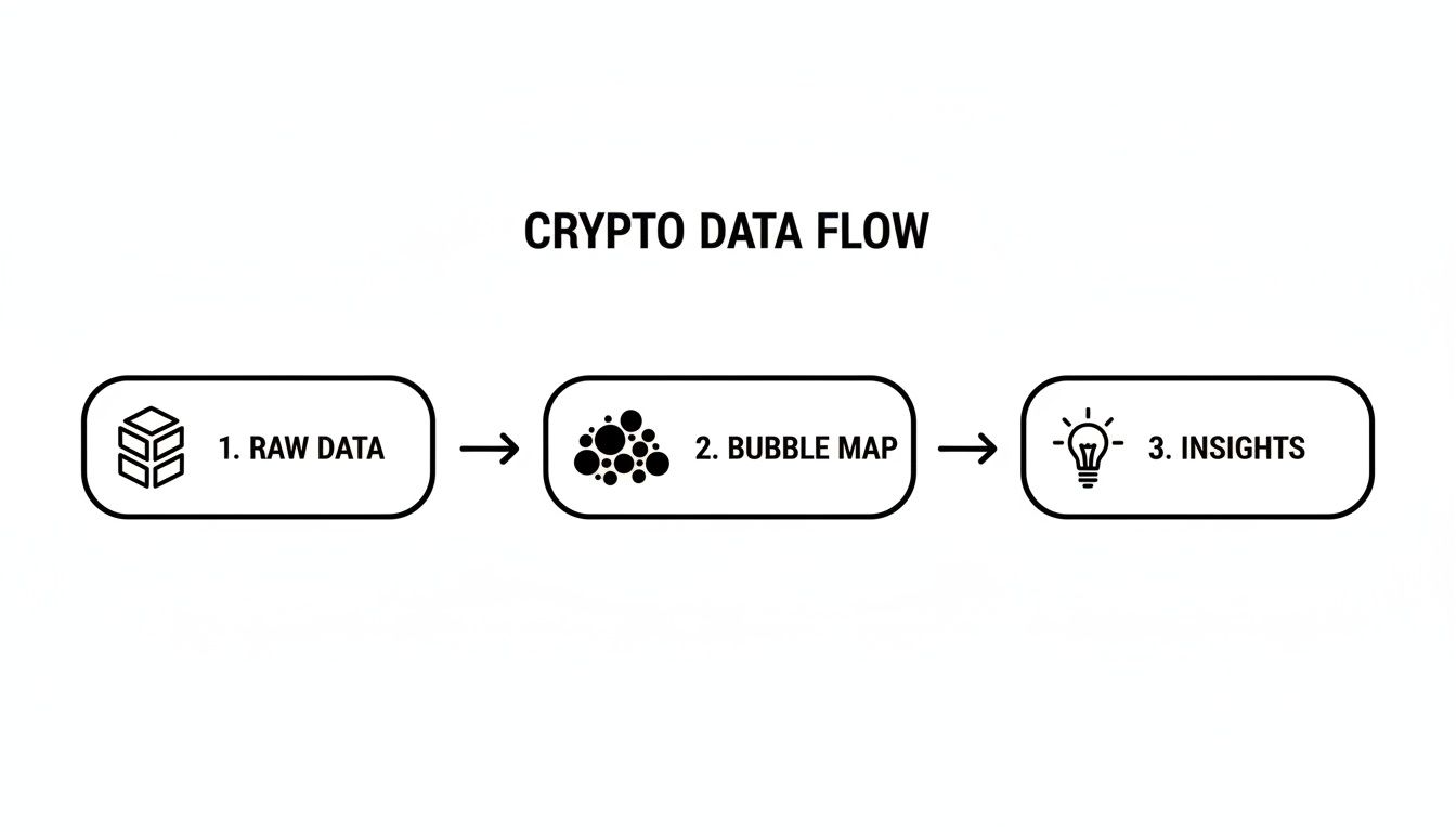
This process turns that complex raw data into a clear visualization, allowing an analyst to pull out actionable insights for their next move.
The first step is learning the language of the map. Each visual element is like a word, and once you know the vocabulary, you can start putting together the sentences that reveal the full picture of a token's on-chain activity.
Here are the core components you need to spot right away:
By focusing on these patterns, you get a quick read on the token’s dynamics. This ties directly into the fundamentals of crypto on-chain analysis, which gives you the broader context for using visual tools like this.
Not all big wallets are bad news. It’s the connections between the bubbles that tell the real story. A skilled analyst knows how to separate normal, everyday market behavior from the early signs of manipulation.
For instance, a large bubble sending funds to a known Centralized Exchange (CEX) wallet is pretty standard stuff. But a large bubble suddenly spraying tokens to dozens of brand-new, smaller wallets? That’s a whole different ball game. This pattern is often a dead giveaway for an upcoming coordinated dump.
A healthy token distribution looks like a diverse mix of small to medium-sized bubbles with very little clustering. In contrast, a map dominated by a few giant, interconnected bubbles should set off alarm bells about centralization and potential market manipulation.
To make it even clearer, here’s a quick cheat sheet for interpreting the most common patterns you'll see.
Ultimately, reading a crypto bubble map isn’t about finding one magic answer. It's about learning to ask the right questions: Does this distribution look decentralized? Are the biggest players buying or selling? Is there any shady, coordinated activity going on? Answering these will help you make smarter, data-backed decisions instead of just guessing.
A crypto bubble map is way more than just a cool visual. Once you get the hang of reading them, these maps become a powerful source of trading signals that can give you a serious edge. It's the difference between just watching the market and actively anticipating its next move.
Think of it this way: a standard price chart shows you what is happening, but a bubble map shows you who is making it happen. By revealing the hidden dynamics of token supply and ownership, you can start to see big moves forming before they ever hit the charts.
The first thing that jumps out on a bubble map is the big players. Those massive bubbles represent the "whales" or "smart money"—the wallets with enough capital to move the market all on their own. The map instantly draws your eye to who holds the most influence.
Watching these whales over time tells a story. Are they in an accumulation phase, where their bubbles are steadily growing? That could signal strong confidence in the project. Or are they in a distribution phase, sending tokens out to exchanges? A large bubble suddenly moving its stack to a CEX wallet is a classic sign that a dump might be coming.
Centralization is one of the biggest silent killers in crypto. When a token's supply is locked up in just a handful of wallets, the risk of price manipulation goes through the roof. A bubble map makes this danger impossible to ignore.
If you pull up a map and see a few giant, interconnected bubbles dwarfing everything else, that’s a massive red flag. It means a small group of insiders can crash the price whenever they feel like it, leaving everyone else holding the bag.
This kind of visual gut-check can save you from investing in projects that look great on the surface but are built on a fragile foundation. A truly decentralized token will have a much more even spread of small and medium-sized bubbles.
Sometimes the real threat isn't a single whale, but a wolf pack. Bubble maps are brilliant at uncovering hidden clusters of wallets that move in perfect sync. These clusters often point to private sale investors, insider teams, or even one person using multiple wallets to fake decentralization.
When you spot a tight knot of wallets all funded from the same place or sending tokens to the same exchange around the same time, you've probably found a coordinated group. Keeping an eye on these clusters is vital because when they decide to sell, their combined force can create huge downward pressure. Spotting this pattern early gives you a chance to get out before they do. This is a perfect example of how wallet data generates powerful token signals that keep you ahead of the game.
Airdrops are a go-to method for new projects to build a community, but they can easily be gamed. A bubble map is the ultimate lie detector for auditing an airdrop after the fact to see if it was actually fair.
Here’s what you can check with a post-airdrop analysis:
By learning to apply these frameworks, a bubble map transforms from a static picture into a dynamic intelligence tool. Every bubble, cluster, and connection tells a piece of the on-chain story. For any serious trader or analyst, learning to read that story is how you find your alpha.
A bubble map gives you a powerful, bird's-eye view of a token’s distribution. It nails the what and the where—showing you exactly which wallets are holding the supply and how funds are clustered together. But if you want to build a trading strategy that actually works, you need to dig into the who and the why. This is where the real magic happens, combining that visual map with cold, hard performance data.
Think of it this way: a bubble map is like a satellite image of a battlefield, showing you where all the big players are positioned. But tools like Wallet Finder.ai are your boots on the ground, giving you the full history and combat record of every general you spot. Marrying these two perspectives turns a static picture into a forward-looking strategy.
It all starts by spotting an interesting wallet on the bubble map. Maybe it's a huge, isolated bubble that’s clearly been accumulating, or a highly connected one that looks like it's getting ready to distribute tokens to other wallets. This visual cue is a fantastic starting point, but it doesn’t tell you the most important thing: is this whale a trading genius or just some lucky early holder?
The next move is critical—you have to vet their track record.
By copying the wallet address right off the bubble map and plugging it into a wallet intelligence platform, you unlock a completely new layer of data. All of a sudden, that anonymous bubble has a face and a verifiable history.
This simple workflow shifts your analysis from just watching what's happening to actively gathering intelligence.
The crypto world is catching on fast. The demand for this kind of on-chain insight is exploding, with platforms like Bubblemaps raising €3 million in 2023 and another €3.5 million in 2024. Its partnerships with giants like Etherscan and DEX Screener prove just how essential this data has become. Traders need to see where the tokens are concentrated before the rest of the market does. You can read more about the growth of on-chain intelligence tools on CoinMarketCap.
Turning this idea into a repeatable edge is surprisingly simple. By integrating bubble map analysis with wallet performance data, you create a system for finding and—more importantly—validating high-potential trading signals.
This is the kind of deep-dive data you can get for any wallet you find.
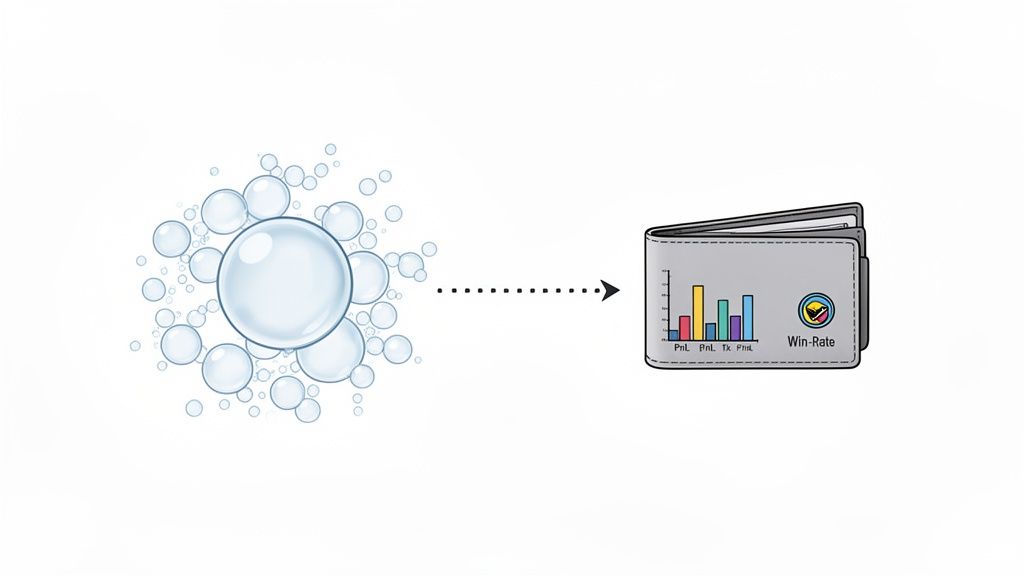
This dashboard immediately lays out the metrics that matter, like PnL and win rate, turning a random string of characters into a transparent trading profile.
If the numbers check out and the wallet has a history of smart, profitable trades, you've just found a "smart money" wallet worth following. From there, you can add it to a watchlist and set up alerts for its future moves. This proactive approach lets you mirror the strategies of proven winners, turning their hard work and perfect timing into your own advantage.
By validating the performance of a whale identified on a crypto bubble map, you shift from making assumptions based on wallet size to making decisions based on proven skill. This simple, two-step process filters out the noise and focuses your attention on traders who consistently outperform the market.
Theory is great, but it only gets you so far. The real test for any analysis tool is how it performs out in the wild, where actual money is on the line. To really bring these concepts home, let's walk through two detailed, real-world scenarios that show how a bubble map crypto analysis can lead to completely different conclusions—and outcomes.
These case studies will show you how to apply everything we’ve covered, from spotting whales to sniffing out centralization risk, and how to turn those observations into a solid trading thesis. By looking at both a high-risk memecoin and a stable DeFi token, you'll see the full spectrum of insights a bubble map can give you.
First up, let's look at "MemeCoinX," a new token that burst onto the scene with a massive social media hype train. A quick glance at its price chart showed a rocket ship going straight up, pulling in swarms of retail investors chasing a quick flip. A deeper look at its bubble map, however, told a much scarier story.
The map was completely dominated by a few huge, interconnected bubbles. One central cluster alone controlled over 45% of the total supply. That’s an immediate, screaming red flag for extreme centralization risk. The lines connecting these bubbles showed they were all funded from the same original wallet, confirming they were either a single entity or a tightly coordinated group of insiders.
A smart trader using a bubble map would see this and hit the brakes. Here’s the breakdown:
By keeping an eye on this cluster, a trader could have seen the massive sell-off coming. When the insiders finally dumped their holdings, the price of MemeCoinX collapsed by over 90% in just a few hours, wiping out countless retail investors. The bubble map gave an early warning that the price chart never could.
This memecoin scenario teaches a critical lesson: hype and price action can be incredibly misleading. A crypto bubble map peels back the curtain to show you the real power structure, and in this case, it showed the game was rigged from the start.
Now, let's flip the script and look at "DeFiStable," a well-established token for a decentralized finance protocol. This token had been growing steadily for months, backed by a strong community and a real-world use case. Its bubble map painted a picture of health and genuine stability.
Instead of a few monster clusters, the DeFiStable map showed a much more even distribution. Sure, there were several large bubbles, but they were mostly isolated from each other. This suggests they were long-term holders or protocol-owned liquidity pools—not coordinated manipulators. The vast majority of the supply was spread across thousands of small to medium-sized bubbles, representing a wide and engaged user base.
Here’s what an analyst would take away from this map:
This kind of healthy distribution builds confidence for a long-term investment. An investor could look at this bubble map and feel much better knowing the project's success is tied to real community adoption, not the whims of a few insiders. By checking the map periodically, they could also watch for any red flags, like large holders suddenly consolidating tokens or moving them to exchanges.
These two polar-opposite examples show the true power of using a bubble map crypto tool. It adds a crucial layer of due diligence, helping you tell the difference between projects built on solid ground and those built on nothing but hype and manipulation.
A crypto bubble map is a powerful tool, but its power is only unlocked when you know how to use it right. Misreading the data can be just as dangerous as not having it at all, leading you down a rabbit hole of bad assumptions and costly trading mistakes. To get a real edge, you need to avoid a few common pitfalls.
Think of yourself as a detective. A single clue rarely solves the case. You need context, you need to know what to look for, and you definitely need to know what to ignore. In the same way, a sharp on-chain analyst knows how to sidestep the most common traps when reading a bubble map.
This is probably the most common rookie mistake. You spot a massive bubble with thousands of connections and immediately think you've found a mega-whale about to dump on the market. More often than not, this is just a centralized exchange's (CEX) hot wallet.
It makes sense when you think about it. An exchange wallet is a hub, constantly processing deposits and withdrawals for thousands of users. Learning to tell them apart is critical.
Exchange wallets usually have:
If you misidentify an exchange wallet as a malicious whale, you might panic-sell right before a pump. Always double-check large, highly-connected wallets on a block explorer before making any moves.
A single snapshot of a bubble map is like one frame from a movie—it gives you a glimpse, but you're missing the entire plot. True understanding comes from observing how the picture changes over time.
A static bubble map shows you a moment frozen in time. It’s useful, but it's not the whole story. The real alpha comes from watching how the map evolves over days or weeks.
This dynamic view is what reveals the trends that matter.
For instance, a large bubble that stays the same size for a month tells you there's a stable, long-term holder. But if that same bubble shrinks by 30% in a week? That's a huge red flag for selling pressure. Tracking these changes over time is how you spot accumulation or distribution patterns before they hit the price chart.
A crypto bubble map is just one tool in your analytical toolbox. Relying on it alone is like trying to navigate a city with just a map of the subway system—you're missing all the surface streets. To get a complete picture, you have to layer its insights with other on-chain metrics.
Once a bubble map helps you identify a wallet of interest, your next step should be to dig deeper. Plug that address into a tool like Wallet Finder.ai to analyze its transaction history, its profit and loss (PnL), and its overall track record. The bubble map might show a whale is buying, but wallet intelligence tools will tell you if that whale is actually any good at trading. This combination turns a simple observation into a high-conviction trade idea.
Diving into on-chain analysis always sparks a few questions. Let's tackle some of the most common ones about bubble map crypto tools so you can build your confidence and sharpen your analytical edge.
No, a bubble map isn't a crystal ball for calling exact price tops and bottoms. It's much more like a weather radar for the market. It shows you where the big storms (major holders) are gathering and which way the wind (token flow) is blowing.
What they do give you is a powerful insight into supply distribution and holder behavior. These are incredibly strong indicators of potential market pressure. Just remember to use bubble maps as one part of a bigger strategy that includes other on-chain data and market analysis.
Not always. While a tight cluster of wallets can definitely be a red flag for coordinated manipulation, you have to look at the context before hitting the panic button.
Lots of legitimate entities show up as big, clustered bubbles. For instance, you might be looking at:
The real key is to investigate what that cluster is doing. Is it just interacting with smart contracts, or is it sending tokens to exchanges in a coordinated dump? That's the difference between business-as-usual and a reason to be concerned.
This really depends on the token's age and volatility. If you're looking at a brand-new, highly volatile memecoin, checking the bubble map crypto daily is a smart move. The holder landscape can shift dramatically in a matter of hours.
On the other hand, for more established, "blue-chip" tokens with lower volatility, a weekly or even monthly check-in is usually enough to spot any significant changes among the top holders.
A bubble map helps you spot the whales, but you need another tool to know if they're any good at trading. That's where a wallet performance tracker comes in.
Once a bubble map identifies the "whales," a wallet tracker helps you vet their skill. It lets you dig into the profitability and trading history of the wallets you find, making sure you're following the smart money, not just the big money.
Ready to go from just spotting whales to tracking their every move? Wallet Finder.ai gives you the performance data you need to validate your on-chain insights and copy the strategies of top traders. Find your next winning signal at Wallet Finder.ai.

A premier DeFi analytics platform empowering traders to discover and analyze profitable blockchain wallets, trades and tokens.