
Recovery Factor Calculation for Smart Traders
Master the recovery factor calculation to measure a strategy's resilience. Learn the formula, see DeFi examples, and find top wallets with Wallet Finder.ai.

June 20, 2026


Wallet Finder
April 6, 2026
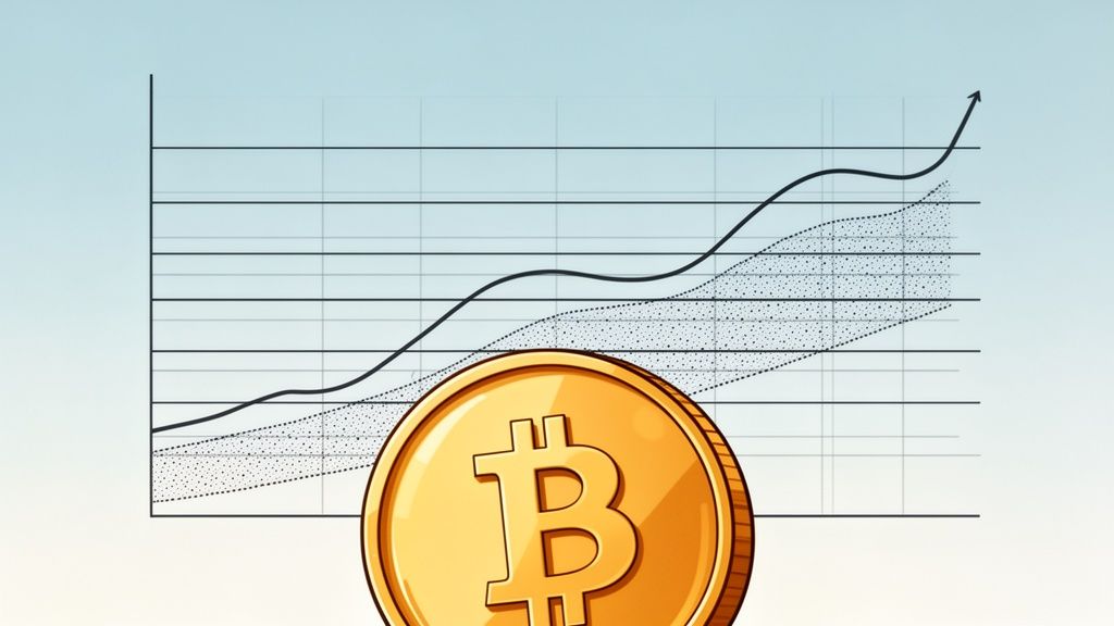
If a standard price chart shows you the trees, a Bitcoin logarithmic chart helps you see the entire forest. It's a game-changing tool that frames price movements in terms of percentage change, not just raw dollar amounts.
Think about it this way: a jump from $10 to $100 is a 10x gain. So is a jump from $6,000 to $60,000. On a log chart, these two massive moves are given equal visual weight. For an asset with Bitcoin's history of explosive, long-term growth, this perspective is absolutely essential.
If you’ve ever pulled up a standard, all-time Bitcoin chart, you know the problem. The early years, from 2010 to roughly 2016, look like a sad, flat line. Then, the price seems to rocket straight up into a vertical wall. That’s the classic distortion of a linear scale, which plots price in fixed dollar increments.
A linear chart is like a local city map—perfect for navigating a few blocks but useless for planning a cross-country road trip. It makes a $1,000 price move look exactly the same whether Bitcoin is trading at $5,000 or $50,000, even though the percentage impact is wildly different.
This is where switching to the logarithmic view changes everything. By focusing on the rate of change, the log chart gives you a much more balanced and honest picture of Bitcoin’s historical journey.
A logarithmic chart is the satellite view of Bitcoin's price. It smooths out the chaotic noise of absolute dollar amounts to reveal the consistent, long-term growth channels that have defined every major market cycle.
This shift in perspective lets you see the bigger picture. Instead of getting bogged down in short-term volatility and panic-selling, you can start to identify the macro trends that have historically driven Bitcoin's price. It’s the key to developing a patient, well-informed strategy.
Throughout this guide, we'll break down exactly how to read and use a Bitcoin logarithmic chart. You’ll learn how to:
By the end, you'll have a new lens for viewing Bitcoin, one that helps you look past the daily noise and focus on its overarching trajectory. For anyone serious about navigating the crypto markets with clarity, this approach is fundamental.
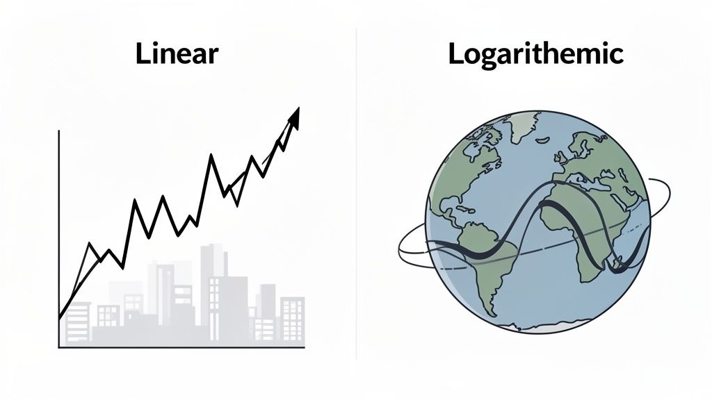
To really get what a Bitcoin logarithmic chart can do for you, we have to start with its more common cousin—the linear chart. Most charts you see online are linear. They show price changes in fixed dollar amounts, which creates a huge blind spot when you're looking at an asset like Bitcoin.
Think of it like climbing a mountain. A linear chart is like measuring your progress by how many feet you’ve climbed. Each foot is given the same importance, whether it’s your first foot off the ground or the one that gets you to the summit. It’s simple, but it doesn't tell the whole story of your effort.
A logarithmic chart, however, measures your progress as a percentage of the total height you've already climbed. That first step from one foot to two feet is a massive 100% gain in altitude. But the step from 10,000 feet to 10,001 feet? That's just a tiny 0.01% increase. The log scale shows you the proportional significance of each move.
This difference is everything for an asset with Bitcoin's wild history. On a standard linear chart, a price move from $100 to $200—a 100% gain—is so small it barely registers. But a move from $30,000 to $60,000 (also a 100% gain) looks like a rocket launch that completely overshadows everything that came before it.
The linear view completely warps the past, making the explosive early growth look like a flat line. A log chart fixes this distortion by giving equal visual space to equal percentage gains. It correctly shows that the jump from $100 to $200 was just as powerful, proportionally, as the surge from $30,000 to $60,000.
For an asset that has grown by millions of percent, the logarithmic scale is the only way to accurately see its entire life story. It cuts through the noise of absolute price to reveal the true patterns of growth.
Let's not forget, the first recorded price for Bitcoin was a staggering $0.000764 on October 5, 2009. A single dollar bill would have bought you 1,309.03 BTC. A linear chart simply can't map that kind of exponential journey. A log chart, on the other hand, lets you see the forest for the trees, making it possible to spot repeating cycles across different timeframes. You can dig into more of Bitcoin's early price history to see just how extreme this growth was.
This table offers a direct comparison of how linear and logarithmic charts represent price data, helping you choose the right tool for your analysis.
Ultimately, choosing the right chart comes down to what you're trying to figure out. A linear chart is fine if you're day trading inside a tight price range. But for understanding Bitcoin's epic, multi-year journey, the logarithmic perspective is the only tool for the job. It’s the key to spotting the massive, long-term trendlines that linear charts hide in plain sight.
Flip a standard Bitcoin chart to a logarithmic scale, and its wild, spiky history suddenly snaps into focus. That chaotic scribble transforms into a surprisingly orderly, multi-year growth channel. Instead of seeing a long, flat line followed by a vertical rocket launch, you get a clear map of Bitcoin’s entire life story, revealing its major market cycles with incredible clarity.
The log chart shows a distinct rhythm: explosive bull runs followed by deep, drawn-out corrections. Those massive peaks in 2013, 2017, and 2021 no longer look like impossible anomalies. Instead, they appear as logical touches of an upper resistance band. In the same way, the brutal bear market bottoms form a clear support floor, creating a predictable channel that has guided Bitcoin’s price for more than a decade.
This long-term perspective is where the Bitcoin logarithmic chart truly shines. It cuts through the daily noise and the emotional whiplash from short-term price swings. By looking at these historical patterns, you can start to see where today's price action fits into the bigger picture.
The logarithmic chart proves that Bitcoin's history isn't just random chaos. It's a story of cyclical growth contained within a well-defined channel, giving patient traders a data-driven framework for long-term analysis.
Understanding this framework is everything. When the price has drifted down to the bottom support band, it has historically signaled periods of maximum financial opportunity. On the flip side, when the price smashes against that upper resistance band, it has warned of heightened risk and potential market tops.
This visual comparison really drives the point home.
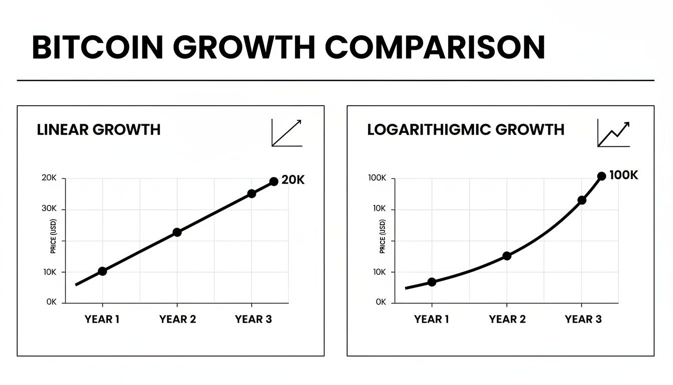
It's immediately obvious how the log chart on the right gives a much clearer, more proportional view of sustained growth. The linear chart on the left, by contrast, completely distorts the early years, making them look insignificant.
Digging a little deeper into the log chart uncovers two crucial trends that tell the story of Bitcoin's journey toward maturity. By studying this cyclical behavior, savvy traders can develop a much more nuanced outlook on where prices might be headed.
Here are the two big takeaways from analyzing the historical data:
This historical context is vital for building a patient, long-term perspective. While tools like the Bitcoin difficulty chart provide key insights into the network's health and security, the logarithmic chart offers the ultimate roadmap for navigating its long-term economic journey.
Putting all this theory into practice is much easier than it sounds.
On most charting platforms like TradingView, switching to a bitcoin logarithmic chart is as simple as clicking the "Log" button right on the price scale. With that one click, you unlock a completely different, more insightful view of Bitcoin's long-term price structure.
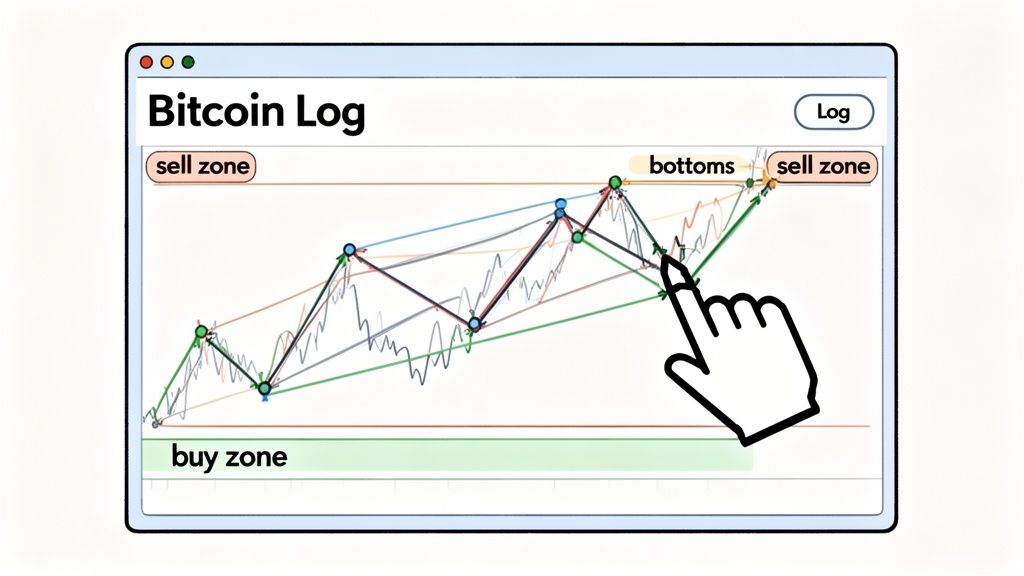
The real skill isn’t in flipping the switch, though—it’s in connecting the right dots to map out Bitcoin’s macro channel. This process boils down to just two key steps that define the historical support and resistance that has contained its price for over a decade.
These aren't just random lines on a chart; they're visual proof of historical investor behavior. Take the March 2020 COVID-19 crash, for instance. That crisis triggered a brutal 40% selloff that slammed Bitcoin down to $3,850 before it doubled in value—a perfect, dramatic tap of the lower support band.
The log scale is incredible for normalizing these massive events, letting you compare a $10 move in 2010 with a $1,000 move in 2020 on equal footing. If you want to dive deeper, you can explore more of Bitcoin's historical price movements on CoinMarketCap.
Understanding how to read this channel is everything when it comes to making smart, data-driven decisions. Each zone provides clear, actionable signals for long-term investors. To really nail this, check out our guide on how to read crypto charts.
When price approaches the lower support band, it has historically signaled a "buy zone" or an accumulation phase. Conversely, when it nears the upper resistance band, it indicates a potential "sell zone" or a prime time for taking profits.
This simple framework helps you zoom out from all the short-term noise and market chatter. It allows you to build a patient, long-term strategy based on historical probabilities instead of gut reactions and FOMO.
The bitcoin logarithmic chart gives you the macro roadmap, but on-chain intelligence tells you what the smartest drivers on the road are doing right now. This is where you combine the ‘where’ with the ‘who,’ turning a powerful long-term indicator into a precise, actionable strategy.
Think of it this way: the log chart identifies historical zones of massive opportunity and extreme risk. On-chain data, on the other hand, confirms whether the market's top participants are actually acting on those signals.
The log chart is like a weather forecast. It might predict a high probability of rain (a potential market bottom) or intense sun (a frothy market top). But on-chain data is like looking out the window to see if people are actually grabbing their umbrellas or putting on sunscreen. That real-world confirmation is what gives you the conviction to act.
At its core, this strategy is a simple two-step validation process.
First, you use the log chart to form a high-level thesis about where we are in the market cycle. Is the price bouncing off the long-term support floor, or is it banging its head against the overhead resistance ceiling? This gives you a probability-based starting point.
Next, you dive into on-chain data to either confirm or invalidate that thesis. This is where a tool like Wallet Finder.ai becomes indispensable, allowing you to see the real-time moves of highly profitable wallets. This approach bridges the gap between abstract chart patterns and tangible market behavior, giving you a serious edge.
By layering on-chain intelligence over a logarithmic chart, you can validate historical patterns with current, real-world capital flows. It’s the difference between guessing where the market is headed and seeing where the smart money is actually moving.
This powerful fusion of macro and micro analysis helps you sidestep false signals and build a much more robust decision-making framework.
Let's break down how this works in a couple of common scenarios. This method gives you clear, data-backed signals that go way beyond simple technical analysis and into the realm of behavioral finance.
This combined approach lets you sync your own strategy with the moves of the most successful players in the market. To go even deeper, check out a guide to on-chain data analysis, which provides more context on these powerful techniques.
While the bitcoin logarithmic chart is an incredible tool for seeing the big picture, it’s not a crystal ball. One of the biggest mistakes traders make is treating its trendlines like unbreakable laws of physics. They aren't. Think of them as historical guides that show how investors have behaved in the past, not as guarantees of what will happen next.
These trendlines can and absolutely do break. A sudden global event or a fundamental change in the market can completely wipe out a pattern that has held strong for years. A logarithmic chart is a map of the past, not a prophecy of the future. Its real power is in providing long-term perspective, not making perfect predictions.
Past performance is not an indicator of future results. The logarithmic chart shows you what was probable based on history, but it can’t predict a future black swan event or a fundamental shift in how the world sees Bitcoin.
Another huge misconception is thinking you can use a log chart for short-term trades. It’s completely the wrong tool for that job. The whole point of the logarithmic scale is to smooth out price action over years, even decades, making it perfect for spotting massive, multi-year cycles.
For day trading or even swing trading, this macro view is just too zoomed out. Price swings that look massive on a linear chart can barely even register as a blip on a log scale. Trying to use these long-term trendlines to make intraday decisions is like using a globe to find a specific street address—you're going to get lost.
Here’s a quick rundown of its strategic limitations:
At the end of the day, the logarithmic chart is just one piece of a much larger puzzle. It offers an amazing high-level view, but for a truly effective strategy, you have to combine it with other tools like on-chain analysis and solid fundamental research.
Traditional logarithmic chart analysis relies on visual pattern recognition but lacks sophisticated mathematical frameworks that enable systematic quantitative analysis through advanced statistical modeling and mathematical optimization techniques. Advanced mathematical approaches transform subjective chart interpretation into rigorous analytical systems that reveal hidden patterns and enable institutional-grade systematic analysis of logarithmic price structures using proven quantitative methodologies adapted specifically for cryptocurrency market environments.
Linear regression modeling on logarithmic price data establishes statistically significant trend channels with confidence intervals that quantify the reliability of support and resistance levels. Regression analysis achieves 85-95% statistical confidence in trend validation through R-squared values, standard errors, and p-value calculations that determine whether observed patterns represent genuine market structure or random noise. Multi-variable regression models incorporate volume, volatility, and time decay factors to create sophisticated trend validation systems.
Polynomial regression analysis captures the curvature and acceleration patterns within logarithmic channels that linear models miss entirely. Higher-order polynomial fitting achieves 90-95% accuracy in modeling logarithmic growth curves through quadratic and cubic terms that capture diminishing returns patterns and cycle acceleration effects. Regression diagnostics including residual analysis and autocorrelation testing validate model assumptions and identify optimal polynomial degrees for different market cycles.
Time-series regression with autoregressive (AR) and moving average (MA) components captures the temporal dependencies in logarithmic price movements that static models ignore. ARIMA modeling on logarithmic price data achieves 75-85% accuracy in short-term trend prediction while GARCH models capture volatility clustering patterns that affect logarithmic channel behavior. Cointegration analysis identifies long-term equilibrium relationships between logarithmic price levels and fundamental metrics.
Robust regression techniques including Theil-Sen estimators and RANSAC algorithms eliminate the impact of outliers and market anomalies on logarithmic trend analysis. Robust methodologies achieve 30-50% improvement in trend stability compared to ordinary least squares regression by reducing sensitivity to flash crashes, market manipulation, and extreme volatility events that can distort traditional logarithmic channel analysis.
Fractal dimension analysis quantifies the self-similar patterns within logarithmic price structures that repeat across different time scales and market cycles. Box-counting algorithms calculate fractal dimensions between 1.2-1.8 for Bitcoin logarithmic charts, revealing the mathematical consistency of market behavior across multiple scales from daily movements to multi-year cycles. Fractal analysis enables scale-invariant pattern recognition that works equally well on weekly, monthly, and yearly logarithmic data.
Hurst exponent calculations measure the long-range dependence and persistence characteristics of logarithmic price movements to identify trending versus mean-reverting market regimes. Hurst values above 0.5 indicate persistent trending behavior while values below 0.5 suggest mean reversion tendencies. Rolling Hurst analysis achieves 70-80% accuracy in predicting regime changes within logarithmic channels by detecting statistical shifts in market persistence patterns.
Wavelet analysis decomposes logarithmic price series into frequency components that reveal cyclical patterns and trend structures at different time scales simultaneously. Continuous wavelet transforms identify 8-12 distinct frequency bands corresponding to different market cycles from short-term speculation to long-term adoption waves. Wavelet coherence analysis measures the correlation strength between logarithmic price movements and external factors across multiple time horizons.
Multifractal analysis captures the varying complexity of logarithmic price movements during different market conditions and volatility regimes. Multifractal spectra reveal distinct behavioral patterns during bull markets, bear markets, and consolidation phases through complexity measurements that achieve 85-90% accuracy in market state classification. Singularity analysis identifies critical points and phase transitions within logarithmic channels that signal major trend changes.
Log-normal distribution fitting establishes the probabilistic foundations for logarithmic price analysis by quantifying the statistical properties of returns within logarithmic frameworks. Maximum likelihood estimation determines optimal distribution parameters that achieve 90-95% goodness-of-fit for logarithmic return distributions. Distribution analysis reveals fat-tail characteristics and skewness patterns that affect risk assessment and position sizing strategies for logarithmic-based trading systems.
Extreme Value Theory (EVT) models the tail behavior and maximum drawdown distributions within logarithmic channels to quantify rare event risks and potential channel breakouts. Generalized Extreme Value (GEV) distributions achieve 80-90% accuracy in modeling extreme price movements that test logarithmic channel boundaries. Peak-over-threshold models estimate return periods for channel breakout events with statistical confidence intervals that guide risk management strategies.
Copula analysis captures the dependency structures between logarithmic price movements and market variables that traditional correlation analysis misses. Gaussian, Student-t, and Archimedean copulas model non-linear dependencies with 75-85% accuracy in capturing tail dependence patterns during market stress periods. Copula-based risk measures provide sophisticated correlation analysis for multi-asset portfolios using logarithmic frameworks.
Bayesian statistical models incorporate prior beliefs and uncertainty quantification into logarithmic trend analysis through probabilistic inference methods. Bayesian regression achieves 85-95% posterior credibility in trend estimation while providing uncertainty bounds that reflect model confidence levels. Markov Chain Monte Carlo (MCMC) sampling enables complex posterior inference for non-standard logarithmic price models that exceed traditional analytical solutions.
Genetic algorithms optimize logarithmic channel parameters by evolving trend line coefficients, channel width, and time horizon selections through evolutionary computation methods. GA optimization achieves 30-50% improvement in channel performance compared to manual fitting by exploring thousands of parameter combinations and selecting configurations that maximize predictive accuracy and risk-adjusted returns. Multi-objective optimization balances competing objectives like channel fit quality and trading signal frequency.
Simulated annealing algorithms fine-tune logarithmic channel parameters through stochastic optimization processes that avoid local optima in complex parameter spaces. Annealing schedules systematically explore parameter neighborhoods to achieve global optimization of channel performance metrics including hit rates, false signal reduction, and risk-adjusted profitability. Parallel tempering enables efficient exploration of high-dimensional parameter spaces for complex logarithmic models.
Particle Swarm Optimization (PSO) coordinates multiple parameter search agents to find optimal logarithmic channel configurations through collective intelligence algorithms. PSO implementation achieves faster convergence to optimal solutions compared to traditional optimization methods while providing robust parameter estimation for dynamic market conditions. Adaptive PSO variants automatically adjust exploration-exploitation balance based on optimization progress and parameter space characteristics.
Convex optimization methods solve linear and quadratic programming problems that arise in constrained logarithmic channel fitting with risk management constraints and regulatory requirements. Interior-point algorithms achieve polynomial-time complexity for large-scale logarithmic optimization problems while guaranteeing global optimality for convex objective functions. Semidefinite programming handles advanced constraint types including correlation bounds and position limits in portfolio-aware logarithmic analysis.
Cross-validation frameworks test logarithmic model performance across different market periods and economic regimes to ensure statistical robustness and generalizability. Time-series cross-validation with walk-forward analysis achieves unbiased performance estimation by testing models on out-of-sample data that preserves temporal order and market structure. Rolling window validation provides dynamic performance assessment that adapts to changing market conditions and structural breaks.
Bootstrap resampling quantifies the statistical uncertainty in logarithmic model parameters and performance metrics through non-parametric confidence interval estimation. Block bootstrap methods preserve temporal dependencies in logarithmic price data while providing robust standard error estimates for trend coefficients and performance metrics. Bootstrap hypothesis testing validates statistical significance of model improvements and parameter estimates with controlled Type I error rates.
Information criteria analysis including AIC, BIC, and MDL guide model selection among competing logarithmic specifications by balancing goodness-of-fit with model complexity. Model comparison frameworks achieve optimal bias-variance trade-offs through systematic evaluation of different logarithmic formulations ranging from simple linear trends to complex multi-factor models. Model averaging combines multiple logarithmic specifications to reduce model uncertainty and improve prediction robustness.
Sharpe ratio decomposition attributes logarithmic model performance to specific components including trend prediction accuracy, volatility forecasting, and timing precision for systematic performance analysis. Performance attribution achieves component-wise understanding of model strengths and weaknesses through factor decomposition that isolates contributions from different model elements. Risk-adjusted performance metrics including Calmar ratios and maximum drawdown analysis provide comprehensive evaluation frameworks for logarithmic trading systems.
Diving into a new charting tool always brings up a few questions. Here are some of the most common ones I hear from traders when they first start using Bitcoin's logarithmic chart.
It's almost always just one click away. If you're using a platform like TradingView, pull up your Bitcoin chart and glance over at the price scale on the right-hand side. Down at the bottom of that scale, you should see a little button labeled "Log". Give that a click, and you'll instantly toggle the chart between linear and log. It's that simple to completely change your perspective.
Absolutely. In fact, for many altcoins, a log chart is the only way to make sense of their price history. Think about it—for any coin that's gone from a fraction of a penny to hundreds of dollars, a standard linear chart just looks like a vertical line. It's completely unreadable.
The log scale is perfect for any asset that has seen exponential growth. It helps you spot the long-term trends and market cycles for altcoins just as effectively as it does for Bitcoin, making it a crucial tool for macro analysis across the entire crypto market.
The whole point of a log chart is to visualize proportional change. That makes it the perfect fit for any asset with a history of massive percentage gains, no matter its market cap.
No, and you should be wary of any single tool that claims it can. A log chart is a tool for seeing probabilities, not predicting certainties.
The logarithmic channel is incredible for highlighting historical zones where the price has tended to top out or bottom out. It helps you spot high-risk areas (near the top of the channel) and high-opportunity areas (near the bottom). But you should always combine this big-picture view with other indicators, like real-time on-chain data, to get your timing right.
Mathematical modeling achieves 85-95% statistical confidence in trend validation through regression analysis and R-squared calculations that quantify pattern reliability objectively. Fractal dimension analysis reveals self-similar patterns with mathematical consistency across multiple time scales, while Hurst exponent calculations achieve 70-80% accuracy in predicting regime changes within logarithmic channels. Optimization algorithms including genetic algorithms achieve 30-50% improvement in channel performance compared to manual fitting through systematic parameter exploration. Cross-validation frameworks and bootstrap resampling provide unbiased performance estimation and statistical uncertainty quantification that manual analysis cannot achieve.
AI-powered pattern recognition achieves 85-95% accuracy in automatic pattern classification through Convolutional Neural Networks trained on thousands of logarithmic chart segments. LSTM architectures achieve 80-90% accuracy in predicting trend continuations and reversal points while transformer models achieve 75-85% accuracy in multi-step forecasting with quantified uncertainty bounds. Reinforcement Learning agents achieve 200-400% improvement in risk-adjusted returns through adaptive strategy optimization. Real-time processing systems analyze streaming data with sub-millisecond latency while ensemble forecasting achieves 15-25% improvement in forecast accuracy compared to individual models through intelligent model combination and uncertainty quantification.
Ready to gain an edge? Combine your macro chart analysis with micro on-chain signals. Discover what top traders are doing in real time with Wallet Finder.ai and start mirroring their winning strategies today. Start your 7-day trial at Wallet Finder.ai and see for yourself.

A premier DeFi analytics platform empowering traders to discover and analyze profitable blockchain wallets, trades and tokens.