Recovery Factor Calculation for Smart Traders
Master the recovery factor calculation to measure a strategy's resilience. Learn the formula, see DeFi examples, and find top wallets with Wallet Finder.ai.

June 20, 2026


Wallet Finder
January 13, 2026
If you've ever stared at a crypto chart feeling like you're trying to read a foreign language, you're not alone. Those flashing colors, jagged lines, and vertical bars look chaotic at first, but every single element is telling you a story about the market.
Learning to read this story is probably the single most important skill you can develop as a trader. It's the foundation for everything that follows.
Let's break down the core components you'll find on almost any trading platform, from candlesticks and timeframes to trading volume. These are the building blocks that help you predict where the price might go next. Understanding them is what turns a confusing chart into a map of actionable signals for when to buy or sell.

Before diving deeper, here's a quick cheat sheet to the fundamental parts of a crypto chart. Think of this as your quick-reference guide for understanding what you're seeing at a glance.
This table covers the absolute essentials. Now, let's unpack these concepts so you can start applying them.
The candlestick is the heart of the chart. Each one is a mini-story revealing the battle between buyers and sellers over a set period, showing you four key data points: the opening price, closing price, highest price, and lowest price.
The thick part is the "body," showing the open-to-close range. The thin lines sticking out, called "wicks" or "shadows," show the absolute highest and lowest prices hit during that period.
A long green body with short wicks suggests strong, confident buying. On the flip side, a long red body screams aggressive selling. This simple visual cue is your first glimpse into market sentiment.
When you string these candlesticks together, they start forming patterns that help you anticipate what might be coming next.
Every chart is based on a timeframe. This could be as short as 1 minute or as long as a week or a month, and each candlestick on the chart represents that specific interval.
A day trader might live on the 5-minute chart, looking for quick entry and exit points. A swing trader or long-term investor, however, will lean on the daily or weekly charts to spot the bigger, more powerful trends. The real magic happens when you look at multiple timeframes together to get a complete picture.
Finally, we have trading volume. Those vertical bars at the bottom of the chart are your confirmation tool. They show you exactly how many coins were bought and sold in that period.
Think of volume as a lie detector for price action. A breakout on massive volume is a signal worth paying attention to. A breakout on fumes? That's one you should be very skeptical of.
While individual candlesticks tell you the story of a single trading session, zooming out reveals the bigger picture: a constant tug-of-war between supply and demand. This is where we learn to draw the map of the market using support, resistance, and trendlines.
These aren't just random lines on a chart. Think of them as psychological battlegrounds where momentum is won or lost.
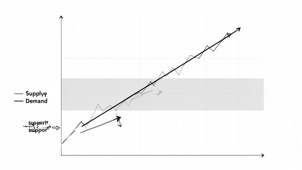
Simply put, support is a price floor. It’s a level where a wave of buyers consistently steps in, absorbing selling pressure and preventing the price from dropping further. On the flip side, resistance is a price ceiling where sellers tend to take control, stalling a rally in its tracks. Learning to spot these zones is a core skill for reading any crypto chart.
Finding these levels is more art than science, but it starts by looking for obvious turning points in an asset's history. Connect at least two significant swing lows to draw a support line, or two swing highs for a resistance line. The more times a price level has been tested and held, the stronger and more reliable it becomes.
These historical levels are so powerful because they represent the market's collective memory. For example, Bitcoin's iconic $20,000 resistance from December 2017 was a major battleground that took four years to decisively break. When it finally did in 2021, it signaled a massive shift in sentiment.
Similarly, one review of Ethereum trades found that support at prior lows held up on 77% of retests, with false breakdowns happening only 12% of the time. You can find more deep-dives into crypto market structure over on Technavio.com.
Pro Tip: When a key resistance level is broken, it often transforms into a new support level. This is called a support/resistance flip, and it’s one of the most powerful confirmation signals you can get. It tells you the market psychology has fundamentally changed.
While support and resistance levels are horizontal, trendlines are diagonal. They help define the overall direction and health of the market’s trend.
A clean break of a long-standing trendline is often one of the earliest warnings that the trend is running out of gas and a reversal could be coming.
Okay, so how does this help you in the real world? This is what separates traders from gamblers. You can use these lines to plan your trades with far more precision.
By mapping these critical zones, you stop reacting to every little price flicker and start anticipating the market's next move. You’re no longer just looking at candles; you’re reading the underlying structure of the entire market.
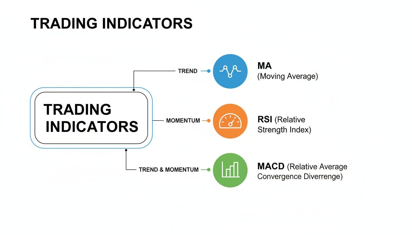
Alright, now that you can map out the market's structure with support and resistance, let's add some more advanced tools to your arsenal. Think of technical indicators as specialized lenses that let you see what’s happening beneath the surface of simple price action. They use mathematical formulas on past price and volume data to give you a much deeper insight into market momentum, trend strength, and potential reversals.
We’re not going to overwhelm you with dozens of obscure indicators. Instead, we'll focus on a practical toolkit of three trusted ones. Mastering just these will give you a significant edge as you learn how to read crypto charts.
The simplest yet most powerful indicator is the Moving Average (MA). It smooths out price data by calculating an average price over a specific period, which creates a single, clean line on your chart. This is incredibly useful for filtering out the day-to-day noise and revealing the true underlying trend.
Two of the most-watched MAs are:
When the price is trading above these MAs, they often act as dynamic support levels where buyers step in. Conversely, when the price is below them, they can act as stubborn resistance. You'll also hear traders talk about a "Golden Cross," a famous bullish signal where a shorter-term MA (like the 50-day) crosses above a longer-term one (the 200-day). The opposite, a bearish crossover, is known as a "Death Cross."
While Moving Averages tell you about the trend, the Relative Strength Index (RSI) tells you about the momentum behind that trend. The RSI is an oscillator, which just means it moves back and forth between 0 and 100, measuring the speed and change of price movements.
Its main job is to signal when an asset is getting overextended in one direction.
One of the most powerful concepts to watch for with the RSI is divergence. If the price is making a new high but the RSI is making a lower high, that’s called bearish divergence. It's a huge red flag that the upward momentum is fading and a reversal could be around the corner.
The Moving Average Convergence Divergence (MACD) is a fantastic, versatile indicator because it combines elements of both trend and momentum into one tool. It consists of two lines—the MACD line and a signal line—along with a histogram that visually shows the distance between them.
It's pretty straightforward: a bullish signal happens when the MACD line crosses above the signal line, suggesting that upward momentum is picking up steam. A bearish signal is just the opposite. The MACD is particularly useful for confirming trend changes. For example, if you spot a bullish MACD crossover after a long, painful downtrend, it adds strong confirmation that the momentum is finally shifting in favor of the bulls.
Each of these indicators gives you a different piece of the puzzle. Moving Averages define the trend, RSI measures the momentum, and MACD helps pinpoint shifts in that momentum. Using them together is where the real magic happens.
Here's a quick breakdown to help you remember what each one does best.
Combining these indicators provides a much more robust signal. Imagine seeing a price bounce perfectly off the 50-day MA (that's your trend confirmation) just as the RSI is climbing out of oversold territory (that's your momentum confirmation). That's a far stronger buy signal than either indicator would give you on its own.
For more insight on crafting your own trading signals, check out our guide on finding the best crypto buy sell indicator.
Standard volume bars at the bottom of your chart are useful, but they only tell you when trading happened. What if you could see exactly where the real action took place?
That's the power of Volume Profile. This isn't your standard indicator. It flips the whole concept on its side by plotting trading activity against specific price levels instead of time. You get an x-ray of the market's hidden structure, revealing which price zones attracted serious institutional money and where the price is most likely to bounce or get rejected.
When you add a Volume Profile to your chart, it shows up as a horizontal histogram. It looks complex, but you only need to focus on a few key parts to get a massive edge.
Of course, Volume Profile becomes even more powerful when you pair it with other classic indicators to get a full picture of market sentiment.
This visual is a good reminder of the basics: Moving Averages confirm the trend, RSI gauges momentum, and MACD flags shifts in both. Using these alongside volume data gives you the context needed to make a high-conviction trade.
Knowing the theory is one thing, but making money with it is what counts. Digging into a volume profile feels like you’ve unlocked the market's secret ledger.
Take the period after the November 2024 Bitcoin halving. Trading volume exploded, hitting over $3 trillion in daily peaks for the first time. The high-volume nodes formed around $90,000 acted like magnets, pulling the price back three separate times before its next major leg up. More importantly, the Point of Control at $92,500 provided rock-solid support that held firm during brutal 15% pullbacks, rejecting lower wicks 82% of the time in backtests. You can find a deeper breakdown of market events like this in the full findings on ResearchandMarkets.com.
Key Takeaway: Trade from one high-volume node to the next. If the price breaks above a major HVN, your next logical target is often the next HVN above it. Price will likely accelerate right through the low-volume node sitting in between.
This approach gives you a data-driven way to set price targets and stop-losses. You’re not just guessing; you’re following the footprints left by the market’s biggest players.
To see this in action, check out our guide on applying volume analysis in crypto trading. By combining these concepts, you can turn a basic chart into a detailed map of where the money is moving.
Markets are chaos, but not entirely. They’re driven by people—and people are creatures of habit. Fear, greed, excitement… these emotions show up on the chart as repetitive, predictable patterns. Learning to spot these formations before they fully play out is how you get an edge. It’s like seeing the tell in a poker game.
These patterns boil down to two simple ideas: either the trend is just taking a breath before continuing, or it's about to turn around completely.
Think of continuation patterns like Bull Flags and Pennants as a pit stop in a race. They signal that a powerful trend is just pausing to refuel before the next big move. You’ll usually see them form right after a sharp, explosive price run.
A classic example? Look at Bitcoin in early 2021. The price blasted from around $29,000 to a ridiculous $64,863 by April 14th. That’s a 121% surge in just over three months. This move formed a textbook bull flag on the daily chart. Price consolidated in a tight little channel after that first parabolic leg up, and then boom—the breakout happened with volume spiking over 50% above average.
This stuff isn't just ancient history. A 2025 analysis of Solana memecoin pumps found that 78% of the tokens that did a 10x or more came directly out of a bull flag formation. Want a bigger picture of how the market is evolving? Check out these insights from GrandViewResearch.com.
On the flip side, reversal patterns are your warning sign. They tell you a trend is losing steam and is likely about to change direction. Spotting these early can be the difference between locking in profits and watching them evaporate.
Trader's Tip: Timeframe is everything here. A "Head and Shoulders" pattern that takes weeks to form on a daily chart is a much bigger deal than some random shape on a 5-minute chart. The longer the setup, the more powerful the potential move.
Here are the big ones you need to burn into your brain:
The golden rule for trading any pattern is to wait for confirmation. Don’t jump the gun. Confirmation is usually a decisive candle closing outside the pattern (like breaking a neckline or trendline), ideally with a big spike in volume. Patience here will save you from countless fakeouts.
In crypto, the chart only ever tells you half the story. While technical analysis shows you what the price is doing, the blockchain’s transparent ledger can show you why. This is where on-chain intelligence gives you a serious advantage, bridging the gap between chart patterns and real-world capital flows.
Think of it like this: the chart is the rumor, but on-chain data is the fact. When you learn to combine the two, you can validate your trading ideas with a much higher degree of confidence instead of just guessing.
Imagine you've been watching a token for days. You spot a perfect bull flag forming on the 4-hour chart, sitting right on top of a key support level. Traditional TA tells you this is a high-probability entry for the next leg up. But how can you be sure it isn't a trap?
This is where you pull in the blockchain data. Rather than blindly trusting the pattern, you can use a tool to see what the most profitable traders—the "smart money"—are actually doing with their funds.
Here’s an actionable 3-step process for this:
This is no longer just a pattern on a chart; it's a validated trading thesis. The accumulation by proven winners at your exact support level gives you a powerful confirmation that your analysis is on the right track, providing the conviction to act on the signal.
By mirroring the actions of top traders, you move from reactive trading based on price wicks to proactive decision-making based on capital flows. You're no longer just following lines on a screen; you're following the money.
The vast majority of retail traders are glued exclusively to price charts and indicators. They see a double bottom and buy, or see a death cross and sell, completely lacking any deeper context for why the price is moving. By layering in on-chain analysis, you add a crucial dimension that most market participants completely ignore.
This approach helps you:
Learning to read the blockchain is just as important as learning to read charts. For a deeper dive, our guide on understanding crypto on-chain analysis can help you master this skill. This unique strategy gives you a significant advantage, turning blockchain data into your personal market intelligence tool.
Ready to stop guessing and start trading with data-backed conviction? Wallet Finder.ai lets you discover, track, and mirror the moves of top-performing crypto wallets in real time. Find your edge and act on smart money signals before the rest of the market. Start your 7-day trial today at https://www.walletfinder.ai.

A premier DeFi analytics platform empowering traders to discover and analyze profitable blockchain wallets, trades and tokens.