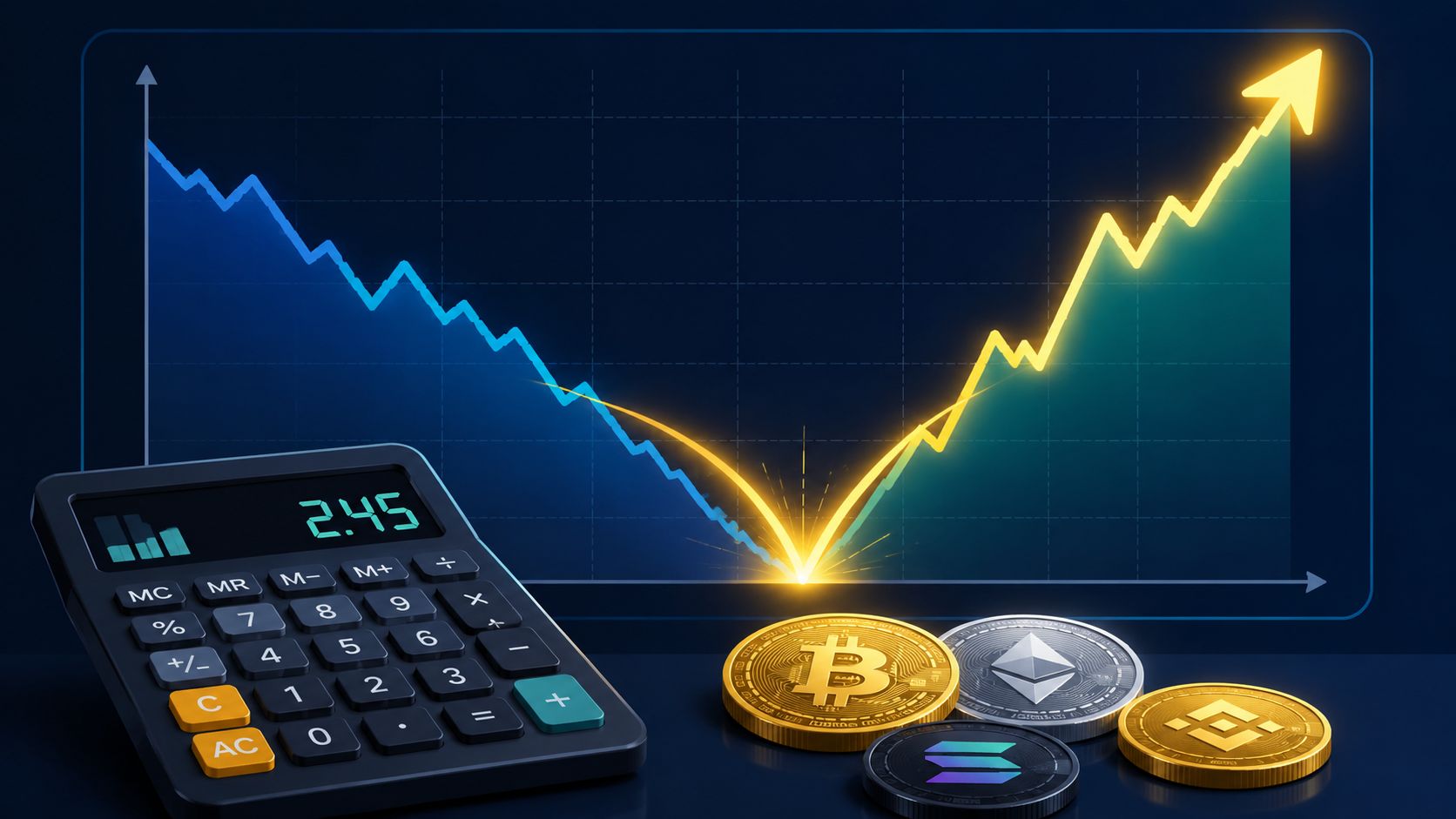
Recovery Factor Calculation for Smart Traders
Master the recovery factor calculation to measure a strategy's resilience. Learn the formula, see DeFi examples, and find top wallets with Wallet Finder.ai.

June 20, 2026


Wallet Finder
February 17, 2026

When you're trying to figure out where the crypto market is headed, price charts only tell you half the story. Volume analysis gives you the other half. It’s the practice of looking at how much of an asset is being traded to understand the strength behind price moves and spot what might happen next.
Think of it as the market’s heartbeat. A strong, steady volume suggests a healthy, confident trend. A weak, sputtering volume? That often signals uncertainty or a lack of conviction.
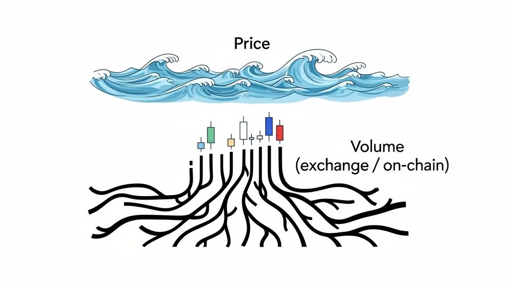
Let’s stick with an analogy. Imagine the crypto market is an ocean. The price chart shows you the waves on the surface—sometimes they're calm, other times they're choppy and violent. Volume analysis is what lets you see the powerful currents flowing deep underneath, the real forces driving the market’s direction. It’s the story of the money and conviction behind every single candlestick.
A sudden price spike without any real volume behind it is often just a blip, a bit of noise that doesn't mean much. But pair that same spike with a huge surge in volume, and you’ve got a powerful signal of strong buying pressure and genuine market interest. This is the fundamental concept that helps you stop reacting to price and start understanding the market psychology driving it.
To really get a grip on volume, you have to know its two most important forms: exchange volume and on-chain volume. They might sound similar, but they tell completely different tales about what’s happening.
We dive deeper into this in our full guide to crypto on-chain analysis, but the distinction is critical. High exchange volume can just be market noise; a big spike in on-chain volume is a signal that demands your full attention.
By tracking the footprints of large transactions on the blockchain, you can differentiate between temporary speculation and the deliberate actions of well-informed investors.
Here’s a quick table to help you keep these two vital metrics straight and understand what each one is really telling you.
MetricExchange VolumeOn-Chain VolumeWhat It MeasuresSpeculative trading activity on exchanges.Actual asset transfers on the blockchain.Primary SignalShort-term market sentiment and liquidity.Long-term conviction and smart money moves.ReliabilityCan be inflated by wash trading or bots.High; represents verifiable transactions.Use CaseIdentifying intraday trends and retail interest.Spotting institutional accumulation or distribution.
At the end of the day, both types of volume offer clues, but on-chain volume cuts through the noise to show you where the real conviction—and the real money—is flowing.
Forget price for a second. Volume is the real pulse of the market. It’s the unfiltered story of every boom, bust, and game-changing event in crypto’s history, recorded transaction by transaction.
Think of volume as the market’s memory. Every massive spike you see on a chart is a footprint left by a major event that shaped the industry. By connecting those surges to specific moments in time, you start to see the narrative of how smart money moves. To do a proper volume analysis crypto traders have to look back to understand what’s happening right now. The wallets that made the right moves during those chaotic periods are the ones worth watching today.
The growth in crypto trading volume is just staggering. Back in 2013, the entire market saw a mere $258.49 million in trading volume for the whole year. Fast forward to the ICO boom of 2017, and volume exploded by 53,020.28%, hitting an incredible $22.89 trillion. You can dig into these historical shifts over on CoinCodex.com.
This cycle of explosive growth just keeps repeating. The market bounced back from the 2018 crash, eventually peaking at $131.43 trillion in 2021. Then 2024 came along and shattered all previous records, soaring to $150.57 trillion in yearly volume. This latest wave was kicked off by the Bitcoin ETF approvals and fueled by memecoin mania on chains like Solana and Base.
These aren't just big numbers; they reveal a fundamental truth about this market.
Massive market events are always telegraphed by enormous shifts in trading volume. If you can spot these shifts early, you can catch the next big wave before everyone else.
While exchange volume gives you a sense of the overall market hype, on-chain volume tells a much more specific story. A sudden spike in transaction volume on Ethereum or Solana is often the first clue that a new, profitable trend is brewing under the surface.
Just look at the biggest crypto narratives from the past few years:
By digging into historical on-chain volume, you can pinpoint the exact wallets that were consistently ahead of these trends. This isn't just about looking at the past; it's about building a filtered list of smart money traders whose strategies have been proven to work, cycle after cycle.
The article covers OBV, VWAP, and CMF as the essential volume indicators. All three are time-based: they plot volume measurements against the passage of time, giving you a running picture of how volume has accumulated day by day. Volume Profile does something fundamentally different and more useful for identifying where price is likely to find support, resistance, and explosive movement. Instead of plotting volume against time, it plots volume against price, showing you exactly which price levels have traded the most volume over any period you choose.
The output of a Volume Profile calculation is a horizontal histogram layered directly on the price chart. Each price level gets a bar extending to the right, with the bar's length representing how much volume traded at that specific price. The three key levels this produces are:
The Point of Control (POC) is the single price level where more volume has traded than any other price in the selected range. This is the most important level on the entire chart because it represents where the market has found the most agreement between buyers and sellers. In crypto markets, price has a magnetic tendency to return to the POC during consolidation periods, because the volume concentration at that level creates the highest liquidity for large participants to enter or exit positions. When a token trades significantly above or below its POC for extended periods, a mean reversion toward that level becomes a high-probability setup.
The Value Area is the range of prices containing 70% of all volume traded in the selected period, bounded by the Value Area High (VAH) and Value Area Low (VAL). The 70% threshold comes from the statistical concept of one standard deviation in a normal distribution and reflects where the market spent most of its time during the reference period. VAH and VAL function as the strongest support and resistance levels available from volume data, consistently outperforming manually drawn horizontal lines because they are derived from actual transaction volume rather than visual pattern recognition.
The most reliable Volume Profile trade setups in crypto are built around two scenarios. The first is a return to value after a breakout. When Bitcoin or any altcoin breaks aggressively above the VAH, it often pulls back toward the VAH level before continuing higher. The VAH becomes support during this retest because the volume concentration below it created a price level where buyers are willing to defend their positions. Entering on a confirmed retest of VAH with volume contraction during the pullback gives you a high-probability entry with a well-defined stop below the POC.
The second scenario is a low-volume node gap fill. Between areas of high volume concentration on the profile, there are sometimes regions with very thin volume called Low Volume Nodes (LVNs). Price moves through LVNs quickly because there is little historical volume to act as friction. When you identify an LVN between the current price and a distant POC, you have a potential roadmap for rapid price movement: price will likely accelerate through the LVN toward the POC, where volume concentration will eventually slow it. This pattern appears repeatedly in the volatile gaps created during major crypto news events and exchange listings.
Unlike OBV and VWAP, Volume Profile is available natively on TradingView as both the "Volume Profile Visible Range" (VPVR) and "Volume Profile Fixed Range" (VPFR) tools, with the fixed range version allowing you to analyze any specific historical period. Setting the range to the current market cycle, from the last major bottom to present day, gives you the most relevant POC and Value Area for current trading decisions.
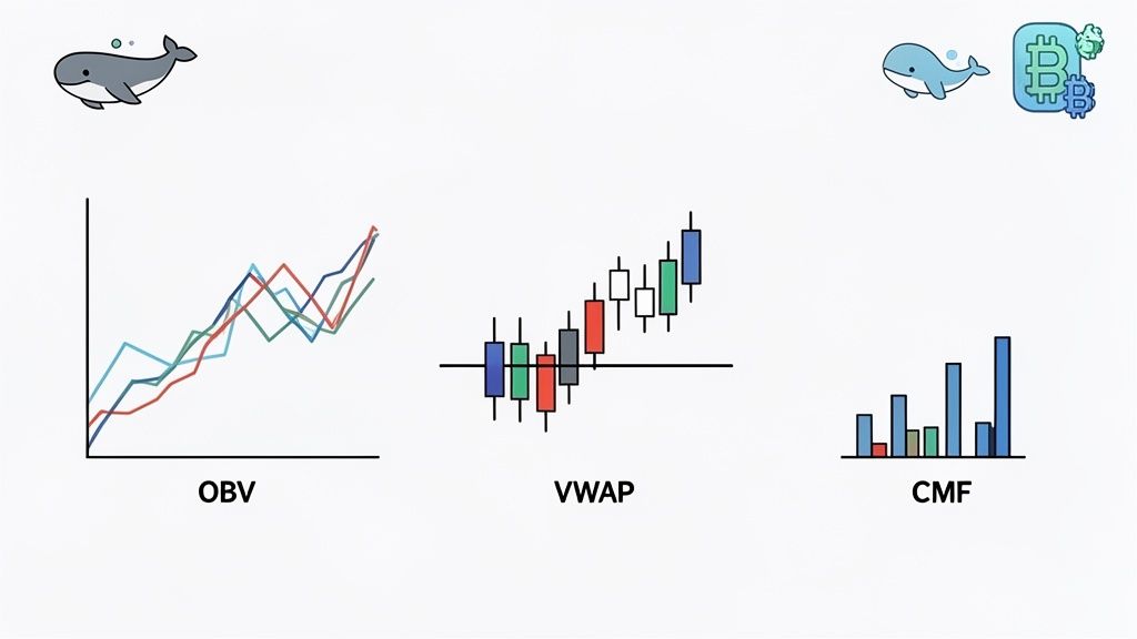
So, how do you turn all that raw volume data into something you can actually trade with? This is where volume indicators come into play. They’re tools that crunch volume and price data together to expose what’s really happening under the hood—things like buying pressure, selling exhaustion, or where the "real" average price is.
Think of these indicators as different lenses for your camera. Each one gives you a unique perspective on the market's activity, helping you confirm if a trend is legit, spot when a reversal might be coming, and even see the subtle footprints left by smart money.
Some volume indicators have been around for decades, long before crypto even existed. They’re staples of technical analysis for a simple reason: they work. Mastering a few of these is a must for any serious trader.
These classic indicators give you a solid foundation. But in the world of crypto, you can get an even cleaner signal by going straight to the source: the blockchain itself.
On-chain metrics give you a level of transparency that exchange-based indicators just can't touch. They cut through the noise of high-frequency trading and bots to show you where actual capital is moving. Any serious volume analysis crypto strategy needs to incorporate these blockchain-native signals.
Exchange indicators show what traders say they're doing. On-chain metrics show what they’re actually doing. It’s the ultimate source of truth.
Here are a few on-chain metrics to watch:
When you start combining the classic technical indicators with verifiable on-chain data, you’re building a much more bulletproof trading framework. You can see a trend forming on an exchange chart and then confirm it with the hard evidence of real assets moving on the blockchain. That’s how you get a real edge.
Volume patterns are the market’s body language. They show you the conviction—or lack thereof—behind every single price move, telling you whether a trend has real momentum or is just running on fumes. Learning to read these patterns is a core skill in volume analysis crypto, and it will completely change how you look at charts.
Think of a strong trend like a rocket launch. For the price to blast off and keep climbing, it needs a powerful thrust of volume pushing it higher. A price that just drifts upward on weak, sputtering volume is like a rocket with a faulty engine; it probably won't get very far before it comes crashing back down.
The dance between price and volume creates distinct patterns that reveal the market's psychology at any given moment. When you learn to spot these scenarios, you can start to anticipate trend continuations, reversals, or even the traps being set by bigger players. It’s like learning to read the emotions of the crowd.
Here are the most critical patterns you need to master:
The most powerful signals in volume analysis show up when price and volume are telling you two different stories. This disagreement, known as divergence, is often the earliest warning sign that a major trend is about to run out of gas and reverse.
The most explosive market turns almost always telegraph their punch with volume signals beforehand. If you know what you’re looking for, you can spot a trend losing steam or hitting its breaking point well before the rest of the market catches on.
Two of the most potent reversal patterns are exhaustion and capitulation.
Learning to identify these patterns shifts you from being a reactive trader to a proactive one. You're no longer just chasing price; you're interpreting the market's collective mind and getting positioned ahead of the herd.
The article introduces the concept of divergence as a warning signal when price and volume "tell two different stories." This framing is correct but incomplete. Volume divergence is a structured trading methodology with four distinct types, each with different probabilistic implications and different failure conditions. Understanding which type you are looking at and when it historically produces reliable signals versus false ones changes divergence from a vague concept into a usable trading tool.
Regular bullish divergence occurs when price makes a lower low while the volume indicator, typically OBV or CMF, makes a higher low. This is the classic reversal signal: price is declining but selling pressure is weakening, suggesting the downtrend is running out of sellers. In ranging and mildly trending markets, regular bullish divergence on OBV has historically preceded meaningful upward reversals with roughly 55% to 65% reliability across multiple backtesting studies of crypto markets. The setup is most reliable when it forms at a key support level or after an extended downtrend of 30 or more days.
Regular bearish divergence is the mirror: price makes a higher high while OBV or CMF makes a lower high. Buying pressure is weakening even as price reaches new heights, signaling that the rally is losing its volume foundation. This is the exhaustion spike signal referenced earlier in the article expressed in divergence terms. It produces the most reliable signals at statistically extreme price levels, meaning near all-time highs or after very extended rallies, because those environments genuinely represent situations where new buyers are difficult to find.
Hidden bullish divergence occurs when price makes a higher low during a pullback in an established uptrend, while OBV or CMF makes a lower low. This is a trend continuation signal rather than a reversal signal: the pullback in price looks more severe than the underlying buying pressure loss, suggesting the uptrend will resume. Hidden bullish divergence is the most actionable signal in strong bull market environments because it identifies pullbacks within uptrends that are likely to resolve higher, giving you a low-risk entry point for adding to winning positions.
Hidden bearish divergence is the downtrend equivalent: price makes a lower high during a rally in an established downtrend while OBV or CMF makes a higher high. The bounce in price looks stronger than the actual buying pressure improvement, suggesting the downtrend will resume. This signal is most reliable in confirmed bear market environments, specifically when identified during relief rallies after extended declines.
The most important and least discussed aspect of divergence trading is its failure rate in trending markets. The mechanism behind divergence assumes that volume is a leading indicator of price, meaning buying or selling pressure changes before price reflects it. In strongly trending markets, this assumption breaks down because institutional participants can sustain a trend through sheer size even as divergence signals accumulate. Bitcoin's 2020 to 2021 bull run produced multiple regular bearish divergence signals on the weekly OBV chart that resolved with continued price appreciation rather than reversals, because the trend had enough institutional momentum behind it to absorb the diminishing retail buying pressure that the divergence was measuring.
The documented failure rate of divergence signals increases substantially in markets with trending behavior versus ranging behavior. Research from quantitative trading literature suggests divergence signals in trending markets fail approximately 40% to 50% of the time, compared to 20% to 30% in ranging markets. The practical defense is using trend filters before acting on divergence signals. A regular bearish divergence on OBV means something very different when price is below its 200-day moving average (confirming a downtrend in which bearish signals are more reliable) versus when price is well above its 200-day moving average in a confirmed uptrend (where bearish signals fail more often).
The additional context variable is the timeframe. Divergence signals on 15-minute charts fail at much higher rates than signals on daily or weekly charts because short-timeframe noise overwhelms the genuine volume signal. Restricting divergence analysis to daily and weekly charts, and requiring alignment between the shorter and longer timeframe divergence signals before acting, substantially improves the signal quality at the cost of fewer trade setups.
Knowing what volume patterns mean is one thing, but actually using that insight to build a profitable strategy? That’s a whole different ball game. This is where the rubber meets the road—we’re going to connect the dots and build a workflow that turns abstract volume data into a concrete playbook for finding and mirroring smart money moves.
The entire process kicks off by spotting tokens or market periods showing unusual volume. A sudden rush of on-chain volume for a small-cap gem or a massive spike across the board tells you something big is happening. These are the breadcrumbs you follow, the moments where real conviction is being shown and opportunity is brewing.
Your first job is to scan the market for these significant volume events. Market-wide shake-ups are often the best place to start. For example, back in October, the combined spot and derivatives trading volumes on centralized exchanges shot up 25.9% to a staggering $10.3 trillion, a huge jump from September's lull. For more on this, check out the data on Coindesk.com.
Massive swings like that are exactly why tools like Wallet Finder.ai are so powerful. They help you cut through the noise and pinpoint the top-performing wallets that were most active during these critical windows.
This is the typical lifecycle you'll see in a trend, moving from a healthy uptrend, to exhaustion, and finally to a reversal.
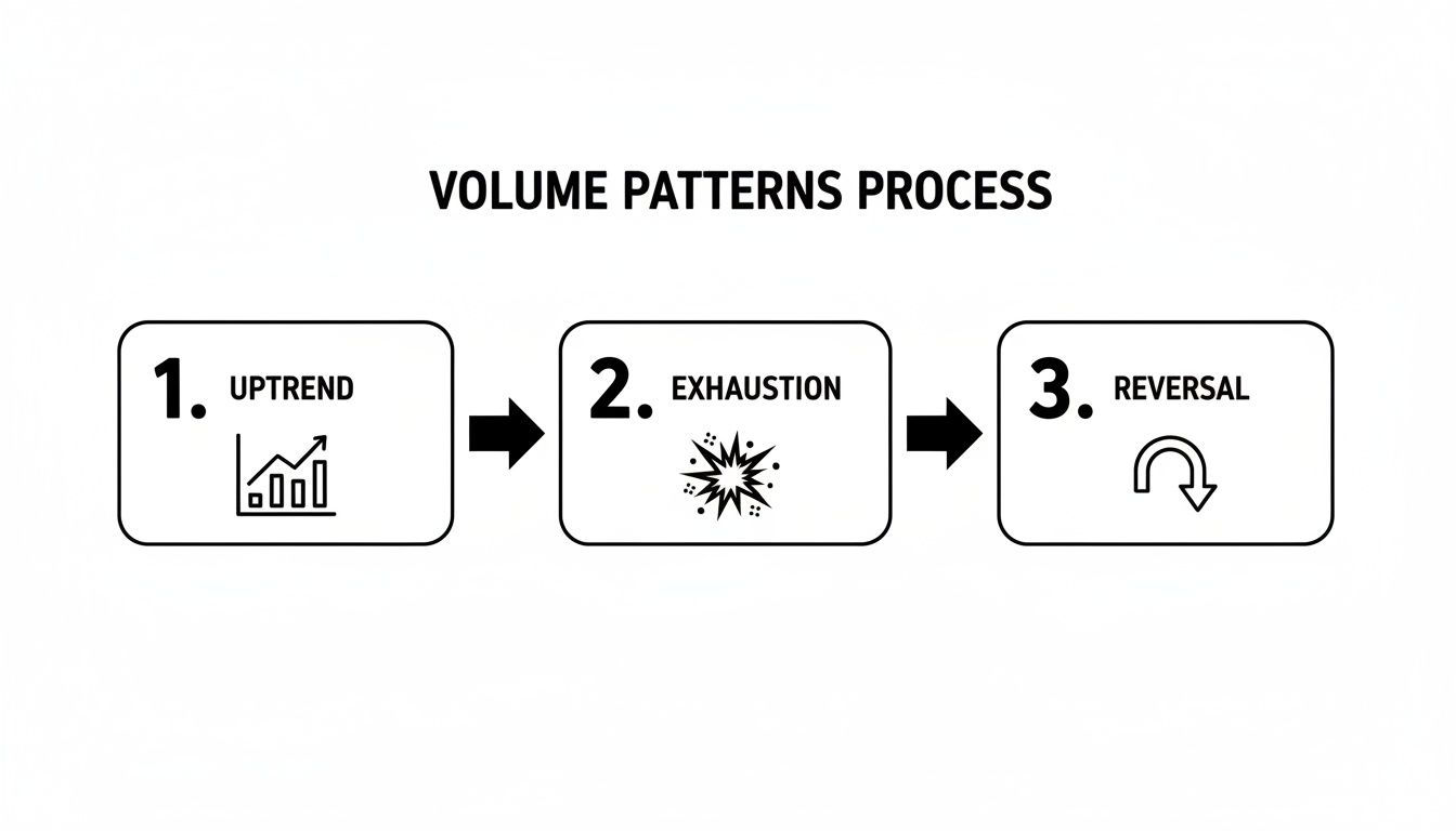
Learning to spot these phases is the key to timing your moves. It keeps you from becoming exit liquidity by buying into a trend just as it's running out of gas.
Once you've flagged a period of high volume, the next move is to find the traders who played it perfectly. With a tool like Wallet Finder.ai, you can filter for wallets that not only had significant activity but also a high PnL during that exact timeframe.
This takes you from looking at the entire market to a curated list of proven winners. The goal here isn't to watch everyone, but to watch the right ones.
With a shortlist of top wallets, it's time to become a detective. You need to dig into their trade history, specifically looking at their entry and exit points relative to those volume spikes you found earlier.
The big question you’re trying to answer is this: Did this wallet start buying before the huge volume spike and all the public hype, or did they sell into the peak mania? This is what separates the smart money from the crowd.
Here’s what your analysis workflow should look like:
This systematic approach to volume analysis crypto trading gives you a clear, repeatable process for turning on-chain data into signals you can actually trade on.
Every volume analysis principle in this article was originally developed for order book markets, specifically centralized exchanges where buyers and sellers submit discrete orders that match against each other at specific price points. Decentralized exchanges using Automated Market Maker architecture operate on fundamentally different mechanics, and applying order-book-derived volume analysis principles to AMM DEX data without accounting for those differences produces systematically misleading readings. Understanding how DEX volume signals differ is essential for any trader operating in DeFi markets.
On a centralized exchange, volume represents matched transactions where a buyer and a seller agreed on a price. Every unit of volume reflects a genuine bilateral price discovery event. On a Uniswap, Raydium, or Curve AMM, volume is generated by trades against a liquidity pool rather than against a counterparty. When a trader swaps ETH for USDC on Uniswap, the "counterparty" is the pool's mathematical pricing formula. The trade executes at whatever price the bonding curve dictates based on the current pool ratio.
The implication for volume analysis is that high AMM volume on a low-liquidity pool is a structurally different signal from high volume on a deep order book. On a CEX with a deep order book, high volume means many buyers and sellers agreed at similar prices, confirming genuine market consensus around that price level. On an AMM with a thin liquidity pool, high volume means many trades forced the price along the bonding curve, which could easily represent a small number of large trades by a single actor moving the price significantly with each swap. The volume number looks similar; the market structure information it carries is completely different.
Uniswap V3 introduced concentrated liquidity in 2021, which created a volume analysis consideration with no equivalent in traditional markets or earlier DEX versions. In V3, liquidity providers can concentrate their capital within specific price ranges rather than distributing it evenly across all prices. This means the effective liquidity depth, and therefore the volume-to-price-impact relationship, changes dramatically depending on where the current price sits relative to active liquidity ranges.
When trading volume moves price into a concentrated liquidity range with substantial capital, the price moves slowly and the volume-to-price ratio is high, meaning large volume is needed to move price significantly. This is the signature of strong support in a V3 pool. When price moves into a region between concentrated ranges, a liquidity gap, the same volume moves price much faster because there is little capital resisting the movement. The volume spike you see during a move through a liquidity gap looks identical on a chart to a volume spike during a genuine strong-interest price move, but they represent opposite market structure realities.
The practical tool for reading Uniswap V3 liquidity concentration is Uniswap V3's own liquidity chart, accessible directly from any V3 pool's page on the Uniswap app, which shows a histogram of liquidity concentration by price range. Before interpreting any volume spike on a V3 token, check whether the price moved through a liquidity concentration zone or a liquidity gap. Moves through gaps on high volume are often rapid and temporary, reverting when price re-enters a concentration zone, while moves through concentration zones on high volume reflect genuine supply/demand dynamics.
Uniswap V3 pools for the same token pair exist at multiple fee tiers: 0.01%, 0.05%, 0.30%, and 1.00%. The distribution of volume across these tiers provides a signal about the sophistication of the traders active in a token. Sophisticated traders and algorithmic market makers concentrate in the lowest fee tier pools when sufficient liquidity exists there, because their high-frequency strategies make fee optimization significant. Retail and long-tail traders often end up in higher fee tier pools because routers direct them there when liquidity is insufficient in lower tiers.
A token where the overwhelming majority of volume, say 85% or more, concentrates in the 0.05% fee tier pool indicates that professional market participants are actively managing liquidity in this token, which is itself a signal of genuine market depth and institutional interest. A token where most volume is in the 1.00% fee tier despite available lower-tier pools suggests that the volume is being generated by less sophisticated actors or that liquidity in the efficient tiers is being deliberately withheld, both worth investigating before treating the volume as confirmation of a genuine trend.

Let’s get our hands dirty and walk through a real-world example. Theory is great, but seeing how a Solana memecoin goes from zero to hero shows you just how powerful a sharp volume analysis crypto strategy can be. This is how you spot opportunities before the Twitter mobs even know what’s happening.
The story doesn't start with a flashy price chart or a big exchange listing. It starts quietly, on-chain. While the token's price was dead flat, a few freshly made wallets suddenly started making big, coordinated buys. This is the first whisper of smart money—the purest accumulation signal you can get. They're building their positions while the coin is still a total unknown.
Phase two kicks off when the token hits a decentralized exchange (DEX), something like Raydium on Solana. This is where exchange volume finally comes into play. The moment trading goes live, the volume goes absolutely vertical.
And what do we see? Those same wallets we spotted earlier are back, and they're buying more as the price starts to climb. That’s your confirmation signal right there. The smart money isn’t cashing out on the first little pump; they’re doubling down, convinced a much bigger move is on the horizon. This is a core lesson in how to track meme token volume trends.
Finally, we hit the grand finale. The coin catches fire on social media, and a massive wave of retail traders piles in, chasing that beautiful, parabolic chart. This flood of new money creates one last, insane volume spike—a classic sign of peak hype and trend exhaustion.
And that’s the exit cue. Right at the peak of the frenzy, the same smart wallets we've been tracking from the very beginning start to unload. They’re selling their huge bags to the starry-eyed newcomers. This entire cycle, from stealthy on-chain buys to a massive retail-fueled blowout, is the classic memecoin pump playbook.
Volume analysis isn't just looking at charts from yesterday; it’s about decoding the market's DNA in real time. Seeing records like 2024's $150.57 trillion in yearly volume shows just how much liquidity floods the market in bull runs, creating these exact kinds of opportunities. Discover more insights on historical market volumes on CoinMarketCap.
Even after you get the hang of volume analysis, it's natural for a few questions to pop up. Here are some of the most common ones I hear, along with clear, direct answers to help you trade with more confidence.
If you're just dipping your toes into volume analysis crypto, keep it simple. Seriously. Start by mastering the standard trading volume bars you see at the bottom of every chart.
Once you're comfortable with those, pair them with the On-Balance Volume (OBV) indicator. The volume bars give you a snapshot of the intensity in a single candle, while OBV shows you the cumulative buying and selling pressure over time. Together, they create a powerful and straightforward foundation for understanding market momentum.
Spotting fake volume, often called "wash trading," is a crucial skill, and this is where on-chain analysis becomes your superpower. Exchanges can manipulate their reported volume pretty easily with bots or coordinated schemes. On-chain transactions, however, are real asset movements that can't be faked.
An asset might look like it has millions in trading volume on an exchange, but when you check its on-chain activity, there’s barely anything happening. This is a massive red flag. Using tools that track genuine on-chain data is your best defense against getting fooled by bogus exchange signals.
Nope. Volume is not a crystal ball for picking exact price levels. Its real strength is in measuring the conviction behind a price move. It tells you how healthy or weak a trend is, not precisely where it's going to stop.
Think of it like this:
By using volume to confirm a trend's health or spot its weakness, you tilt the odds in your favor. You don't need to know the exact top or bottom to be a successful trader.
Ready to turn on-chain volume data into actionable trading signals? Wallet Finder.ai helps you discover the top-performing wallets, analyze their strategies, and get real-time alerts on their next moves. Start your 7-day trial and follow the smart money today at https://www.walletfinder.ai.

A premier DeFi analytics platform empowering traders to discover and analyze profitable blockchain wallets, trades and tokens.