
Decentralized Crypto Wallets: A Practical Guide
Discover decentralized crypto wallets: learn how they work, stay secure, and choose the best option for DeFi and trading.

December 25, 2025


Wallet Finder
December 26, 2025
Order flow charts pull back the curtain on the real-time buying and selling pressure that actually moves a market. It’s a world beyond simple price action. While traditional charts show you the outcome—the price went up or down—order flow shows you the cause. You get to see the raw transaction data between aggressive buyers and sellers, which gives you a genuine edge in understanding what’s really going on.
Trying to understand a market with only standard candlestick charts is like watching shadows on a wall. You see the shape of the movement, but you have no clue what force is creating it. Order flow charts are the architectural blueprints, revealing the underlying battle between buyers and sellers as it happens.
While lagging indicators like the RSI or MACD are busy analyzing old price data to guess at future moves, order flow charts show you what’s happening right now. They visualize the raw transaction data, offering a transparent view of market activity that is otherwise completely invisible.
At its heart, any market moves for one simple reason: an imbalance between aggressive buyers and sellers. When market buy orders overwhelm market sell orders, the price has to move up to find new sellers. When aggressive sellers dominate, the price drops. It's that simple.
Order flow analysis makes this dynamic visible. It’s not about predicting the future with complex formulas; it’s about reading the present reality of the market to make more informed decisions. By seeing where large orders are being executed, you can identify true supply and demand.
Traditional charting methods and order flow charts offer fundamentally different ways of looking at the market. One shows you the result, while the other shows you the process. Grasping this distinction is the key to appreciating just how deep the insights from order flow can go.
To make this crystal clear, let's put them side-by-side.
This table breaks down the core differences, showing why order flow offers a much deeper layer of market insight.
By dissecting each candle to reveal the volume traded at both the bid and the ask, order flow charts expose critical events that are otherwise hidden. You can spot exactly where large players are absorbing pressure, where sellers are getting trapped, or where a trend is running out of steam. This deeper layer of information is what gives traders a massive analytical advantage.
To really get what's happening in the market, you need to see beneath the surface. Your standard candlestick chart shows you what price did, but order flow charts reveal the raw forces—the actual buying and selling—that made it move.
Each type of chart is like a specialized lens, giving you a unique perspective on the constant battle between buyers and sellers.
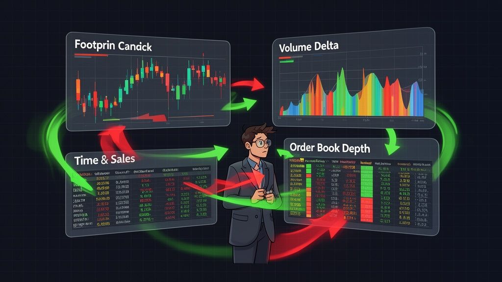
Think of it like a doctor trying to diagnose a patient. They wouldn't just look at the person; they'd use an X-ray, an MRI, and blood tests to get the full picture. As a trader, you need different order flow charts to properly diagnose the market's health. Let's break down the five most essential types you'll encounter.
This diagram nails the core difference: candlesticks show you the shadow of what happened, while order flow charts reveal the force that cast it.
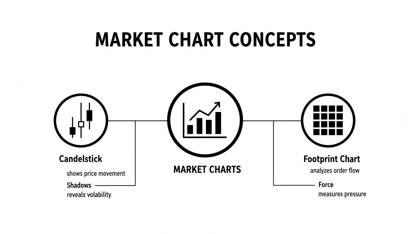
One shows the result, the other exposes the cause. That's a game-changer when you're trying to figure out what happens next.
The Footprint Chart (sometimes called a cluster chart) is the most granular view you can get. It cracks open each candlestick and shows you the exact volume traded at every single price level inside that bar, separating the buyers from the sellers.
Imagine a single candle on your chart. The footprint is an X-ray of that candle, showing you its guts. Instead of just seeing that the price went up, you can see if aggressive buyers were hammering the top of the candle or if massive sellers were secretly absorbing all that buying pressure near the lows.
The Volume Profile flips the script. Instead of showing volume over time, it shows trading activity at different price levels. It’s that horizontal histogram you see on the side of a chart, highlighting where the market has spent the most time and traded the most volume.
Think of it as the market's memory. It points out the price levels that traders have collectively decided are "fair" or important. The thickest bars on the profile are high-volume nodes (HVNs), which act like gravity for price, often becoming powerful support or resistance zones.
The most important part of a Volume Profile is the Point of Control (POC)—the single price level with the most traded volume. This is where the most business got done, representing the peak of agreement between buyers and sellers.
While a footprint chart gives you a snapshot of one bar, Cumulative Delta (CVD) keeps a running score of the battle between aggressive buyers and sellers over an entire session or trend. When more volume hits the ask price (buying), the CVD line climbs. When more volume hits the bid (selling), it falls.
This chart is the ultimate tug-of-war scorecard. It tells you, over time, which side is truly winning the aggression game. To really dig into this, our complete guide on Cumulative Volume Delta will help you master its signals.
An Order Book Heatmap visualizes the entire limit order book over time, showing you where large clusters of passive buy and sell orders are waiting to be filled. It's not about trades that have already happened; it’s about the orders sitting on the sidelines. Bright, "hot" spots on the map show you where the liquidity is stacked up.
This tool is basically a weather map for the market, showing you where potential storms (huge walls of orders) are brewing. These liquidity walls often act as powerful support and resistance because it takes a ton of aggressive market orders to chew through them.
The Time & Sales tape is the most raw and fundamental order flow tool there is. It's a simple, scrolling log of every single trade as it executes, showing the time, price, and size. It looks chaotic at first, but it gives you a real-time feel for the market's rhythm.
Watching the tape helps you sense the market's flow. You can see the pace of transactions speed up at critical levels or spot massive block trades hitting the tape, confirming that institutions are making moves that aren't always obvious on a standard chart. It's less about finding a specific signal and more about gauging the immediate aggression and pace of the market.
Knowing how to read an order flow chart is one thing, but turning that data into a profitable trade is another skill entirely. This is where you graduate from simply watching the market to actively participating in it, using the flow of orders to pinpoint high-probability setups.
The goal is to spot specific patterns in the real-time torrent of data that scream, "a big move is coming." We're going to break down four of the most powerful and reliable signals you can find on order flow charts.
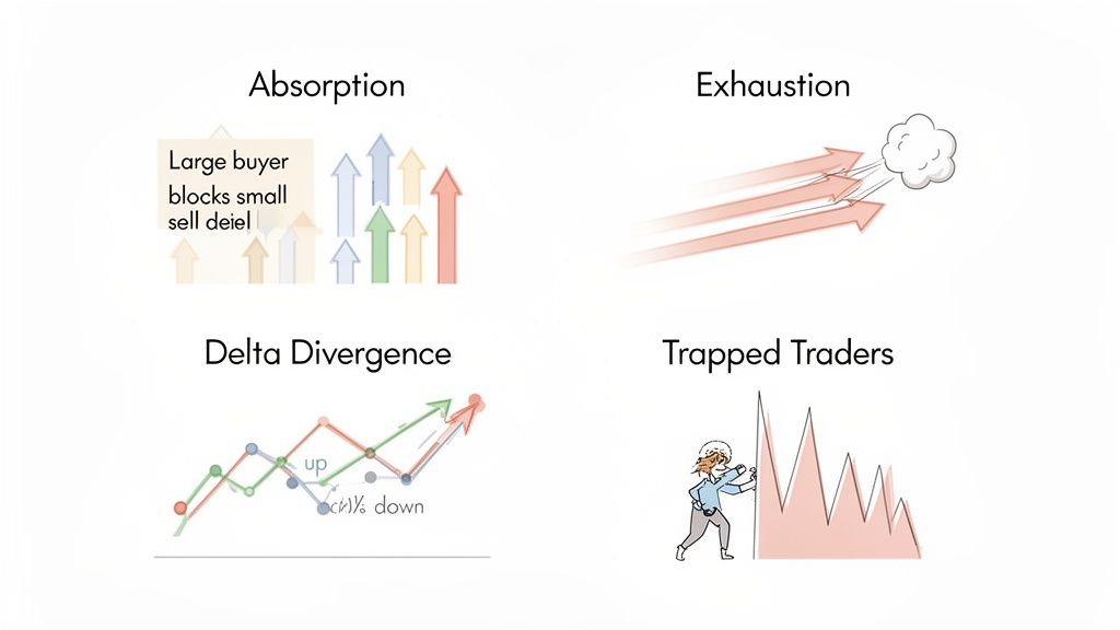
Absorption is one of the clearest tells that large, institutional players are drawing a line in the sand. You’ll see aggressive selling hit the market, but the price just won't budge. Why? Because massive, hidden buy limit orders are quietly soaking up every single sell order that comes their way.
Market exhaustion is the signal that a strong trend is sputtering to a halt. Imagine a powerful uptrend reaching its peak. You might see one last, desperate burst of buying activity, but the price makes little or no new ground. The buyers are still trying, but their efforts are no longer moving the needle.
Exhaustion is the market's way of saying, "I've run as far as I can." Aggressive participants are still pushing, but they’ve met an equal or greater force, and the momentum has stalled. It’s a critical warning that a reversal could be imminent.
Delta Divergence is a fantastic signal that appears when price and order flow start telling two different stories. For example, the price might be grinding out a new high, but the Cumulative Delta is actually making a lower high. This disagreement reveals a hidden weakness in the trend.
It tells you that while the price is inching up, the aggressive buying that got it there is drying up. Fewer and fewer market buy orders are participating in each new high, making the trend fragile and vulnerable to a sharp reversal. You can learn more about similar concepts in our guide on how to track entry and exit signals from DeFi wallets.
Trapped traders are exactly what they sound like: market participants who jumped into a breakout, only to have the market violently snap back against them. A classic setup is when the price breaks a key support level, sucking in a wave of aggressive short sellers, before quickly reversing and shooting back above that same level.
Now, those late sellers are "trapped" in a losing trade. To get out, they're forced to buy back their shorts, which pours fuel on the fire and often triggers a rapid, aggressive move in the opposite direction.
This creates a powerful chain reaction. Spotting trapped traders can give you a high-conviction entry for a trade going the other way.
In the high-stakes world of futures trading, these patterns play out constantly. Footprint charts are incredible for spotting "iceberg orders" that institutions use to hide their true size. For instance, in the E-mini S&P 500 futures market on March 15, 2023, charts lit up with unusual absorption at the 3900 level. Despite 12,500 contracts getting sold in a single 5-minute bar—over $50 million in value—the price barely flinched. Hidden limit orders quietly soaked up 68% of that selling, and within an hour, the price had rallied 1.2%. You can explore more about these institutional tactics in this in-depth analysis of order flow trading.
Theory is great, but seeing order flow in action is where it all clicks. These aren't just abstract ideas—they're real forces you can watch play out every single day in both crypto and traditional markets. Let's break down some actual trading scenarios to see how it works.
We'll start with a classic setup in the futures market and then show how that exact same pattern shows up in crypto. It’s a perfect illustration of how supply and demand principles are universal.
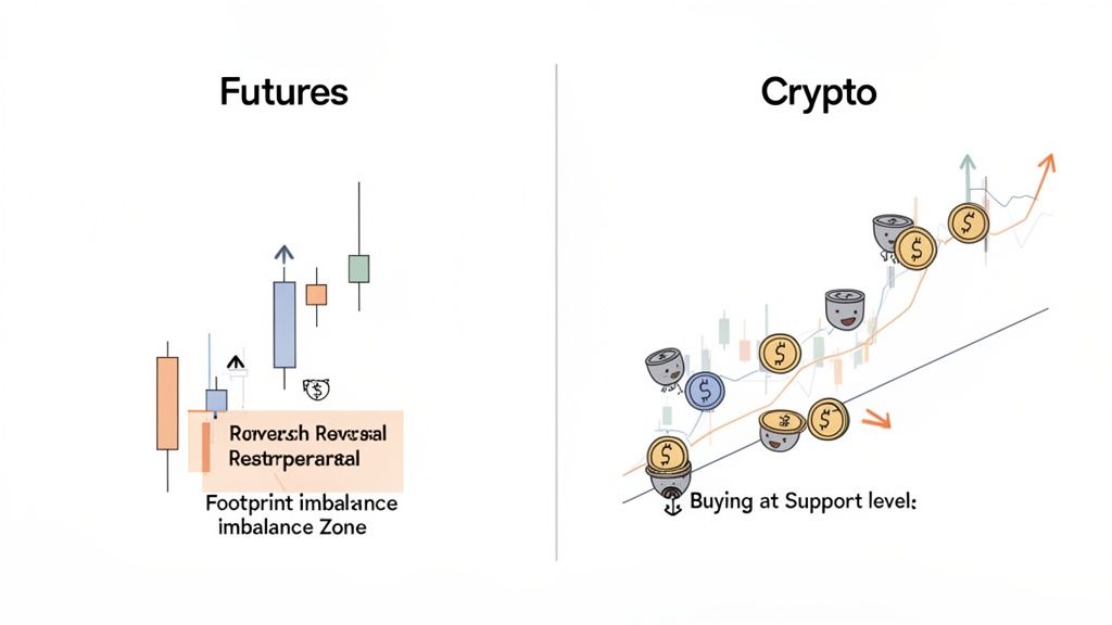
The futures market is the perfect place to see order flow principles at work, thanks to its deep liquidity and heavy institutional trading. A footprint chart, in particular, acts like an x-ray, letting you see the aggressive buying and selling that a normal candlestick chart completely hides. By looking at the volume inside each price bar, we can spot big players accumulating or dumping positions before the price makes its big move.
This gets really powerful when a market looks like it's in a downtrend and every retail trader is hitting the sell button. While the price is dropping, a footprint chart might reveal a huge wall of buy orders quietly soaking up all that selling pressure at a key price level. This is the classic signature of institutional absorption—the big money defending a price they think is a bargain.
On July 12, 2022, the Nasdaq 100 E-mini futures gave us a textbook example. As the market slid, a footprint imbalance showed 8,200 contracts bought at the ask inside the 12,300-12,310 range. Despite a -0.8% price drop, the delta flipped positive to +4,500. This 3:1 buy imbalance was a dead giveaway that institutions were defending the level, trapping shorts in the process. Within two hours, the price ripped 2.1% higher.
Backtests show these imbalances can predict moves with up to 78% accuracy in liquid markets with daily volume over 2 million contracts. You can get a better sense of how pros use this data with these insights on order flow analysis.
So, how does this apply to crypto, where everything is decentralized and there’s no single, central order book? The answer is on-chain analysis. Large buys from smart money wallets are the crypto world's version of institutional block trades.
Instead of looking for a footprint imbalance, we’re hunting for a cluster of large buy orders from historically profitable wallets at a specific price. This on-chain activity tells the same story: smart, sophisticated players are accumulating an asset at a level they believe is critical.
A sudden surge of buys from multiple smart money wallets at a clear support level is a powerful leading indicator. It mirrors the institutional absorption seen in futures, revealing strong conviction from those with the most at stake.
This is where a tool like Wallet Finder.ai becomes essential. By tracking the live activity of top-performing wallets, you're essentially creating your own on-chain order flow chart. When you see a handful of your tracked "smart money" wallets all start buying a token as it dips to support, you're witnessing the exact same absorption principle in action.
Let’s put these two scenarios side-by-side to really see the parallels.
Once you understand that the underlying market dynamics are the same, you can apply these timeless principles across any asset class. Whether it's a big institution defending a level in the NQ futures or a group of DeFi whales scooping up a token, the footprint they leave behind always tells the same story of supply and demand.
So, you've got a solid grasp of how order flow charts work in traditional markets. That’s a huge advantage. But how do you take that knowledge and apply it to the wild, decentralized world of crypto?
It’s all about shifting your perspective. Instead of watching a centralized order book, you're going to use the blockchain's public ledger as your ultimate order flow tool. This is exactly where on-chain analysis and a platform like Wallet Finder.ai come into play.
With Wallet Finder.ai, you can stop guessing and start seeing. Abstract ideas like "institutional absorption" become tangible signals you can actually trade on. The platform essentially lets you treat large, strategic transactions from proven, profitable wallets as major on-chain order flow events. You get a direct line of sight into where the smart money is moving.
The process itself is surprisingly simple. You find the top-performing wallets, set up real-time alerts for their activity, and then analyze their moves with the same critical eye you'd use on a footprint chart. A huge swap from a smart money wallet? That's your on-chain version of a massive delta print hitting the tape.
This turns what looks like random wallet activity into a structured, high-signal data feed. You're no longer trying to guess market sentiment; you're observing the real-time actions of the most successful players.
The real magic happens when you turn these on-chain events into a trading system you can repeat. You're not just passively watching wallets. You're building a workflow to interpret their "order flow" as it happens. This approach perfectly bridges the gap between traditional market analysis and the unique opportunities crypto offers.
Here’s an actionable 3-step process to get you started:
Think of Wallet Finder.ai as your on-chain heatmap and time & sales tape rolled into one. It shows you where the "liquidity" (smart money interest) is clustering and reveals the "tape" of their live transactions.
Of course, not every transaction is a green light to jump into a trade. Just like with traditional charts, context is king. Before you act on any alert, run it through a quick validation checklist to build your conviction.
Your On-Chain Signal Checklist:
In traditional markets, tracking cumulative delta on order flow charts is a statistically dominant way to confirm trends. For example, during the April 2024 OPEC meeting, WTI crude oil futures saw cumulative delta surge to +25,000 lots even as the price went sideways. Buying campaigns were overwhelming sells by 2.7x, right before a 7.3% rally.
This mirrors what we see in crypto. In the Solana ecosystem, 73% of the biggest token launches showed similar whale accumulation patterns, with wallets we tracked posting an average return of 212% for those who mirrored their moves.
Let's get one thing straight: order flow charts are an incredible window into what's happening right now, but they're not a crystal ball. Treating them like an infallible system is the fastest way to get into trouble.
Think of order flow as a high-resolution lens. It sharpens your analysis and brings hidden details into focus, but it's not a standalone strategy that spits out perfect signals. The best traders I know use order flow data to confirm or challenge their trade ideas within a broader market framework. They don’t just react to flashing numbers; they interpret what those numbers mean in the bigger picture.
A structured approach is non-negotiable here. The single best practice you can adopt is to always start your analysis on a higher timeframe. First, figure out the overall market structure—where are the key support and resistance zones? What's the dominant trend?
Only after you have that context should you zoom in with your order flow charts. Use them to dissect the micro-dynamics happening at those critical price levels you've already identified.
It’s also crucial to stick to the right markets. Order flow data shines in high-liquidity environments like major futures contracts (ES, NQ) or top-tier cryptocurrencies. In illiquid markets, the data can be thin and incredibly misleading, making it almost impossible to separate meaningful action from random noise.
The goal here isn't to find a "perfect" entry that never fails. It's about stacking the odds in your favor. You're looking for moments when big players are acting with conviction, giving you a good reason to jump in with them.
Getting the hang of order flow requires the discipline to sidestep the common traps that snag new traders. Misreading the data or jumping the gun on an incomplete signal can be a costly lesson. If you know what to watch out for, you can build a much more robust and realistic process.
Here are the biggest mistakes to avoid:
Diving into order flow charts always sparks a few questions. Let's tackle the most common ones so you can get started on the right foot.
In the world of traditional futures, you can't go wrong with industry workhorses like Sierra Chart, NinjaTrader, or Bookmap. They're known for their powerful customization options and are staples for serious traders.
But for crypto, the game changes. You're not looking at a centralized order book but at the blockchain itself. This is where on-chain analysis tools like Wallet Finder.ai come in. They serve the same core purpose: tracking the "order flow" of smart money and whale wallets to see where the big players are placing their bets.
Mostly, order flow analysis is a scalpel, not a sledgehammer. It’s designed for short to medium-term trading because it's all about what's happening right now with supply and demand.
That said, long-term investors aren't left out in the cold. A Volume Profile chart, for instance, can paint a picture of major accumulation or distribution zones that have built up over weeks or even months. This is gold for spotting significant, long-term support and resistance levels that can inform your bigger-picture strategy.
Not at all. The beauty of order flow is that the principles work whether you're trading with a small account or a large one. The most important thing is to start on a demo account. Get a feel for the data and learn to read the charts without putting any real money on the line.
The real investment isn't capital—it's the time you put into understanding the patterns. Once you are comfortable interpreting signals like absorption and exhaustion, you can apply the strategies with real capital that aligns with your personal risk management rules.
Starting small lets you build experience and confidence where it counts. The insights you get from order flow are about making smarter decisions, and that's a skill that pays dividends at any trading scale.
Ready to see how this plays out on-chain? Wallet Finder.ai lets you track smart money movements and spot high-conviction trades before they move the market. Start your 7-day trial today and turn on-chain data into your new trading edge.
"I've tried the beta version of Walletfinder.ai extensively and I was blown away by how you can filter through the data, and the massive profitable wallets available in the filter presets, unbelievably valuable for any trader or copy trader. This is unfair advantage."
.avif)
Pablo Massa
Experienced DeFi Trader
Smarter trades, made simple.
.svg)
.svg)
.svg)