Recovery Factor Calculation for Smart Traders
Master the recovery factor calculation to measure a strategy's resilience. Learn the formula, see DeFi examples, and find top wallets with Wallet Finder.ai.

June 20, 2026


Wallet Finder
February 6, 2026
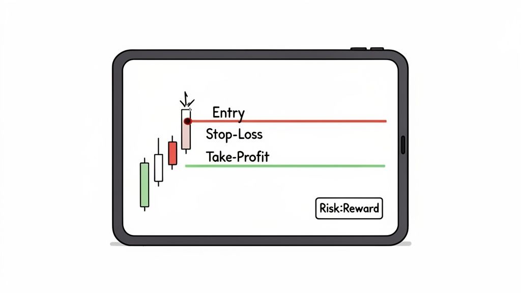
A risk reward chart is a visual tool that plots your potential profit against your potential loss for a trade. It provides a clear, graphical roadmap, showing your entry point, stop-loss (your exit price if the trade goes wrong), and take-profit target (where you secure your gains).
This chart transforms the chaos of market volatility into a concrete, actionable plan.
Staring at a volatile crypto chart can feel like guesswork. A risk reward chart cuts through that noise, acting as a GPS for your trading decisions. Its real value is forcing you to define your entire strategy before a single dollar is at risk. This is the cornerstone of disciplined trading.
Instead of reacting to every price spike or dip, this tool helps you build a proactive mindset. You decide, with a clear head, exactly how much you're willing to lose and what gain you're aiming for. This single habit often separates traders who last from those who burn out.
To master the risk reward chart, you must understand its three core components. These are the building blocks for visualizing your trades and, more importantly, managing your capital. Before you can build a chart, you need these three inputs.
Once you have these numbers, you have a complete picture of the trade's potential outcomes. By defining these three points, you create a visual map. You're no longer just hoping the price moves in your favor; you have a structured plan with defined boundaries for success and failure.
The essence of a risk reward chart is discipline. It's a commitment you make to your strategy before emotions can take over. It's about playing the long game with a statistical edge, not chasing short-term thrills.
This methodical approach is crucial for navigating volatile crypto markets. It forces you to make decisions based on logic and probabilities rather than fear or greed, effectively turning gambling into calculated risk-taking.
Behind every solid risk reward chart is a simple, powerful calculation: the risk-to-reward ratio. This metric separates structured trading from just throwing money at the screen and hoping for the best.
The math is straightforward. First, calculate your total risk—the dollar difference between your entry price and your stop-loss. Then, calculate your potential reward—the difference between your entry price and your take-profit target.
Here’s the formula:
Risk-to-Reward Ratio = (Take-Profit Price - Entry Price) / (Entry Price - Stop-Loss Price)
In practice, we express it as a simple ratio like 1:2 or 1:3. The "1" always represents a single unit of risk, while the second number shows how many units of reward you're aiming for.
Let's use a practical example with Solana (SOL).
Now, let's plug those numbers into our formula.
This gives you a risk-to-reward ratio of 1:3. For every $1 you're risking, you stand to make $3 in profit.
This simple calculation is your first line of defense against emotional trading. A ratio of 1:3 means a single winning trade can erase the losses of three failed trades of the same size, creating a powerful statistical advantage over time.
Aiming for favorable ratios like 1:2, 1:3, or higher is the key to long-term profitability. Traders who consistently take 1:1 trades need a win rate over 50% just to break even after fees.
With a 1:3 ratio, you can be wrong three out of four times and still not lose money. This mathematical bedrock of sound risk management is different from other metrics; explore the key differences between profit factor and the risk-reward ratio in our detailed guide.
This disciplined approach forces you to stop worrying about winning every trade and start focusing on making sure your wins are much bigger than your losses.
You've got the calculations down. Now it's time to turn those numbers into a visual game plan. Creating your own risk reward chart transforms abstract figures into a concrete tool for your trade. We'll cover three actionable methods.
The whole point is to map out your potential loss, your entry point, and your potential profit. This simple diagram really captures the flow, from defining how much you're willing to lose all the way to nailing your profit target.
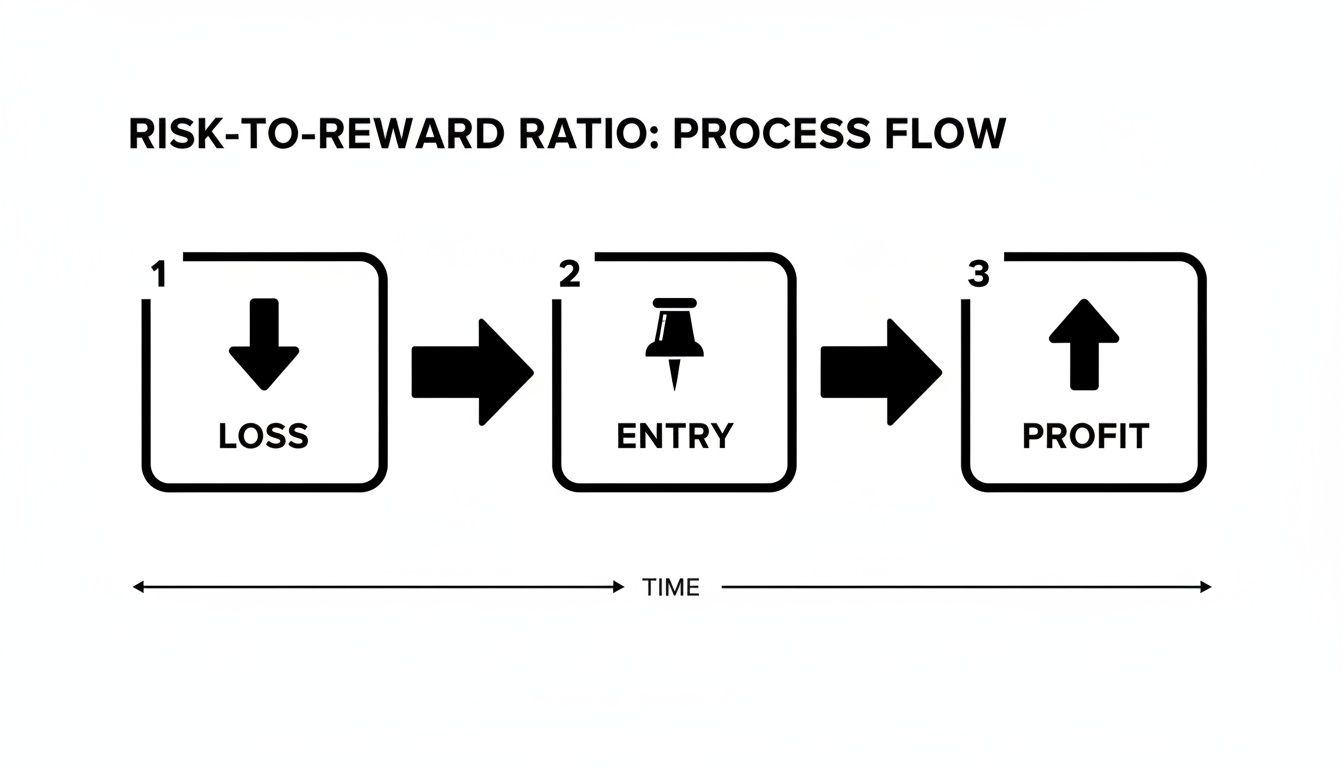
This visual reinforces the discipline of setting your stop-loss before you even start dreaming about the take-profit.
For traders who love full control, a spreadsheet is a fantastic starting point. Using Google Sheets or Excel lets you track and visualize everything without needing fancy software. This approach forces you to manually plug in your data, building the critical habit of planning every trade.
Actionable Steps:
= (Entry Price - Stop-Loss Price)= (Take-Profit Price - Entry Price)= (Reward per Unit / Risk per Unit)For a more integrated, real-time method, use the built-in tools on charting platforms like TradingView. Their "Long Position" and "Short Position" tools let you draw your risk-reward scenario directly onto a live price chart.
Actionable Steps:
This method provides immediate visual context, allowing you to see how your levels align with key support and resistance zones.
Using a platform's built-in tool is all about speed and context. It lets you quickly vet a trade's viability right on the chart, making it easy to spot good setups and discard bad ones before risking capital.
This advanced approach moves beyond your own trades to dissect the proven strategies of elite traders. Tools that analyze on-chain data, like Wallet Finder.ai, let you see the complete trading history of top-performing wallets.
By analyzing a profitable trader's PnL, win rate, and every single trade, you can reverse-engineer their risk management framework. You can see the actual risk-reward ratios they use, how they manage positions, and what defines their edge. This transforms the risk-reward chart from a personal planning tool into a powerful instrument for competitive analysis.
Creating a risk-reward chart is only half the battle. The real skill is learning to read what it’s telling you. Think of your chart as a dynamic guide that tells a story about the market's structure and your place in it.
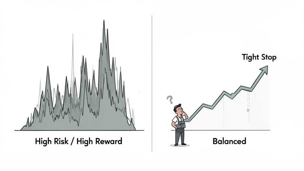
This visual guide helps you understand an asset's personality. A newly launched altcoin might show a wide profit target and a deep stop-loss—a classic high-risk, high-reward scenario. In contrast, a chart for Ethereum might show a much tighter, more conservative structure.
A risk-reward chart's shape changes based on the asset and strategy. Recognizing these patterns is key to making smart, adaptive decisions.
Your chart also tells you when to adapt. If a trade moves strongly in your favor, you can turn it into a "risk-free" trade by moving your stop-loss to your entry price. This guarantees you won't lose your initial capital.
Conversely, if the price stalls, the chart reminds you to stay disciplined and not move your stop-loss further away out of hope. The chart's initial logic should prevail over in-the-moment emotions. To learn more, how to read crypto charts in our comprehensive guide.
A risk-reward chart is your objective anchor in an emotional market. When you feel the pull of greed or fear, look back at your chart. It represents the logical plan you made before your money—and emotions—were on the line.
Bitcoin's history illustrates a long-term risk-reward profile. From April 2013 to recent years, Bitcoin surged nearly 40,000%, delivering an annualized return of about 110%, despite high volatility. Its Sharpe ratio of approximately 1.3 during this period shows the returns historically justified the risk. You can discover more insights about crypto asset risk analysis for more data.
While crafting your own risk-reward chart is a huge step, the real magic happens when you apply the same logic to the market's top performers. On-chain analysis lets you dissect the winning formulas of elite DeFi traders. Their entire history is etched onto the blockchain.
This transparency transforms public data into your private source of alpha. By analyzing the wallets of consistently profitable traders, you can identify those who have mastered the risk-reward game. The mission is to find wallets that showcase repeatable, disciplined risk management.
First, you need to identify wallets with a solid track record. This isn't about finding a one-hit wonder. You're hunting for wallets that demonstrate consistent profitability across many trades.
Here's an actionable checklist for analyzing a trader's wallet:
Putting these pieces together gives you a full picture of a trader’s risk appetite. If you're new to this, our guide on getting started with crypto on-chain analysis is the perfect place to begin.
Once you've shortlisted elite wallets, you can reverse-engineer the exact risk-reward ratios they target. Maybe they aim for a 1:3 ratio on a risky memecoin, or they play it safer with a tight 1:2 on a blue-chip asset.
Watching how top traders manage risk in real time provides lessons you'll never find in a textbook. You get to see their discipline firsthand—how they cut losing trades without hesitation and let their winners ride. It's a masterclass you can apply to your own strategy.
This analysis highlights asset-specific risk profiles. For example, from 2020 to early 2024, Bitcoin’s Sharpe ratio was 0.96, beating the S&P 500's 0.65. Even more telling, its Sortino ratio—which only measures downside volatility—was 1.86, confirming most of its price swings were to the upside. You can discover more insights about Bitcoin's volatility on Fidelity Digital Assets. This data shows how seasoned traders manage the unique risk dynamics of different assets.
A risk-reward chart is a powerful tool, but common pitfalls can turn it into a liability. Sidestepping these mistakes builds the discipline that separates profitable traders from the rest.
A frequent error is setting unrealistic profit targets based on hope rather than technical analysis. This creates a skewed risk-reward chart that looks great on paper but rarely plays out. Another mistake is treating the plan as set in stone. Markets are dynamic; a setup that was perfect yesterday might be invalid today.
A risk-reward chart doesn’t exist in a vacuum. A perfect 1:5 setup is meaningless if you’re trading directly into major overhead resistance. Always consider the broader market context:
A risk-reward chart is meant to enforce discipline, not to justify a trade you’ve already fallen in love with. If the chart doesn't align with what the market is actually doing, the chart is wrong—not the market.
Many traders also fail to manage winning trades. Letting a winning position turn into a loser because you didn't move your stop-loss to breakeven is a painful and avoidable mistake.
Use this mental checklist before entering any trade to ensure your decisions are logical, not emotional.
This disciplined approach is crucial. A deep dive into Bitcoin’s history shows that while volatile, its risk has often been skewed to the upside. Over 11 years, it delivered 29,379% in returns, challenging the simplistic 'it's too risky' narrative. This hammers home the importance of understanding an asset’s specific risk-reward dynamics.
Got questions? Here are some of the most common things traders ask about using risk-reward charts.
A solid benchmark for a good risk-reward setup is 1:2 or higher. This means you should aim to make at least double your potential loss on any trade.
This gives you a statistical edge. With a 1:2 ratio, you can be wrong more often than right and still break even (excluding fees). For more volatile assets like memecoins, you might look for even higher ratios, like 1:5 or 1:10, to compensate for the higher risk. Ultimately, the "right" ratio depends on your strategy, win rate, and the asset you're trading.
A trader's goal isn't to win every trade, but to make sure the wins are big enough to crush the losses. A solid risk-reward ratio is how you build that foundation.
Absolutely. While common in short-term trading, the principles are just as powerful for long-term investments. The mechanics simply adapt.
The logic is identical: define your potential loss against your potential gain before you invest.
They are two sides of the same coin. Your risk-reward ratio defines the quality of a trade setup, while your position size determines how much capital you expose to that trade.
A beautiful 1:5 setup becomes a disaster if you bet 20% of your portfolio on it. A single loss could be devastating. The smart approach is to risk a small, fixed percentage of your total account on any single trade—most professionals stick to 1-2%. This discipline ensures that a losing streak won't knock you out of the game, allowing your high-quality, favorable-ratio trades to grow your account over time.
Ready to stop guessing and start analyzing? Wallet Finder.ai gives you the on-chain data to see how the most profitable traders manage their risk and structure their trades. Discover winning strategies and trade smarter today.

A premier DeFi analytics platform empowering traders to discover and analyze profitable blockchain wallets, trades and tokens.