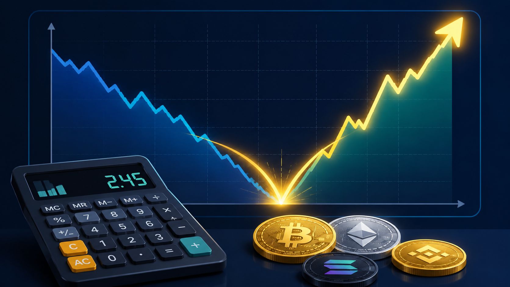
Recovery Factor Calculation for Smart Traders
Master the recovery factor calculation to measure a strategy's resilience. Learn the formula, see DeFi examples, and find top wallets with Wallet Finder.ai.

June 20, 2026


Wallet Finder
May 18, 2026
You're probably looking at a chart right now where price reacted at a level that seemed too clean to be random. It rejected almost to the tick, or it wicked below support, trapped late sellers, and snapped back into range. That's the point where traders stop treating charts as noise and start seeing structure.
Support resistance levels are part of that structure. They aren't magic, and they aren't enough on their own. But if you can mark them well, judge which ones matter, and trade them with discipline, your entries improve, your exits become less emotional, and your risk management gets sharper.
Crypto makes this more interesting. The same level can act like a clean floor in one session, then become a stop-hunt magnet in the next. That's why old-school chart reading still matters, but it works better when you combine it with context, liquidity awareness, and on-chain behavior.
A token rallies hard, tags a prior high, then stalls. Another sells off all morning, touches a level that held before, and buyers suddenly appear. Newer traders often read that as coincidence. It isn't.
What you're seeing is the market returning to areas where traders previously agreed value mattered. Those areas attract attention because people remember them. So do discretionary traders, systematic traders, and algorithms that react to repeated price behavior.
Support and resistance matter because markets don't move through price in a uniform way. They move through zones where buyers and sellers become active again. A prior rejection high becomes a reference point for sellers. A prior bounce low becomes a reference point for buyers.
That's why some prices feel magnetic. Orders tend to cluster there. So does attention.
Markets remember where traders felt pain, urgency, and opportunity. Support resistance levels are that memory made visible.
In crypto, this effect gets amplified because attention moves fast and narratives pull order flow into obvious levels. If a token has a widely watched breakout area, traders crowd around it. Some wait for confirmation. Some front-run it. Some place stops just beyond it. The result is concentrated activity at a narrow part of the chart.
Once you start seeing support resistance levels as decision zones, your process changes:
A lot of poor trades come from acting where the chart gives you no advantage. The market feels random there because, in practical terms, it is.
The trader who marks key levels before the move starts is usually calmer than the trader reacting after the candle closes.
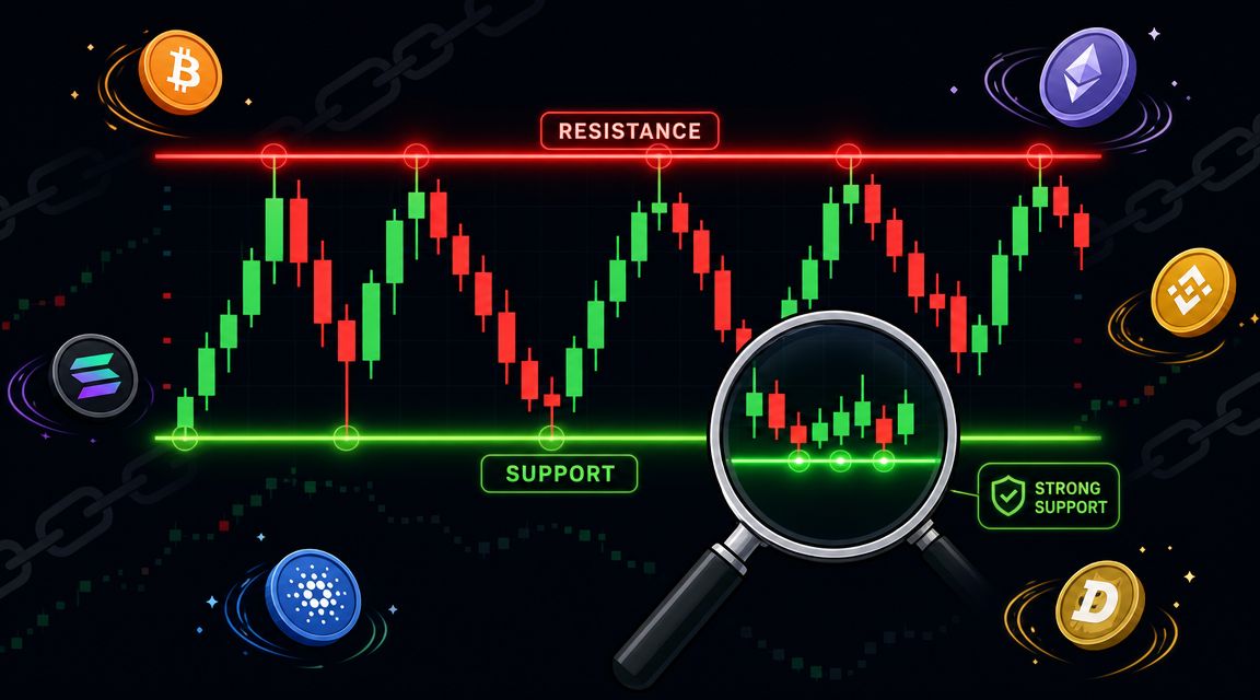
At the simplest level, support is a floor and resistance is a ceiling. Price falls into support and buyers become active enough to stop the decline. Price rises into resistance and sellers become active enough to stop the advance.
That floor-and-ceiling analogy is useful, but only if you connect it to the actual mechanism underneath it. These levels exist because of supply and demand. Fidelity explains that support is the level where demand is strong enough to stop a stock from falling, while resistance is where supply is strong enough to stop it from rising, and it highlights the role-reversal principle where broken support often becomes resistance and broken resistance often becomes support in Fidelity's guide to support and resistance.

A support level forms because buyers believe price is attractive there, or shorts decide to cover there, or both. A resistance level forms because holders sell into strength, short sellers initiate positions, or buyers pull back.
This is why the same chart pattern can look different but still behave similarly. What matters is not the drawing tool. What matters is where buying or selling pressure repeatedly wins.
A practical way to view this concept:
This is the concept that separates basic chart marking from actual trade planning.
Foundational rule: When price breaks below support, that old support often becomes resistance. When price breaks above resistance, that old resistance often becomes support.
That flip matters because traders who were trapped on the wrong side often act when price returns to the level. Buyers who got caught in a breakdown may sell on the retest. Sellers who got trapped in a breakout may cover on the retest. That behavior helps create the new reaction.
They are not promises.
They don't tell you price must reverse. They tell you where a reaction is more likely, where risk can be defined, and where market control may change. That's a big difference.
If you trade them as guarantees, you'll keep buying weak support and shorting strong resistance. If you trade them as areas where the next decision gets made, you'll start acting like a professional.
Most traders overcomplicate this. Start with the chart, not the indicator panel. Mark the levels that stand out before you add anything else.
There are three practical buckets: static levels, dynamic levels, and calculated levels. Each has a use. None should be used in isolation.
Static levels are the backbone of support resistance work. These come from prior swing highs, swing lows, repeated rejections, and consolidation edges.
If price turned multiple times around the same area, that area matters. TradingView's beginner example is simple and useful: if price bounces from $50 three times, that can be treated as support, while $75 acting as a repeated barrier is resistance, as described in SpeedTrader's overview of support and resistance methods.
If you want to improve this skill, spend more time reading candles and structure than adding indicators. A good primer on that process is this guide to price action analysis.
Dynamic levels shift over time. Traders often use moving averages for this purpose because they can act as support in trend and resistance in downtrend.
The trade-off is straightforward. Dynamic levels are useful when the market is trending and less useful when price is chopping sideways. They help you stay aligned with trend, but they can also produce too many reactions if you treat every touch as tradeable.
Use them as context, not as your primary map.
Pivot points matter because they give you a framework that's not subjective. SpeedTrader provides the classic formula:
These formulas remain common because they produce levels from the prior session instead of from your opinion.
Calculated levels are especially useful when you want a repeatable process across many charts. Their weakness is obvious too. They don't know narrative, liquidity conditions, or whether the market is in expansion or compression.
| Method | Type | Best For |
|---|---|---|
| Prior swing highs and lows | Static | Marking obvious reaction zones on any chart |
| Horizontal consolidation boundaries | Static | Range trading and breakout planning |
| Round numbers | Static | Spotting crowded psychological areas |
| Moving averages | Dynamic | Trend context and pullback structure |
| Pivot points | Calculated | Objective intraday reference levels |
| Fibonacci retracements | Calculated | Estimating pullback zones when structure is less clear |
Use a hierarchy.
Start with horizontal levels from raw price action. Add round numbers if they overlap. Then check whether a moving average or pivot level sits in the same area. That overlap is where charts get interesting.
A level found only by an indicator is usually weaker than a level that price itself has already defended or rejected.
Marking levels is analysis. Making money from them requires execution. Most trades around support resistance levels fall into two families: range trades and breakout trades.
The key is knowing which environment you're in. Traders lose money when they fade a real breakout as if it were a range, or chase a weak breakout inside a mature range.

This works when price is respecting a clear floor and ceiling. The goal is not to predict a major trend. The goal is to capture the move from one side of the range toward the other.
A clean framework looks like this:
Find the range
Price has rejected the top area and bounced from the bottom area more than once.
Wait for reaction, not just touch
Don't buy support because price reached it. Buy because price reacted there and showed rejection.
Place the stop beyond the zone
If support breaks cleanly, the premise is wrong. Accept that quickly.
Target the next meaningful area
In a range, that's usually the midpoint for partials and resistance for the larger target.
A practical rule: the cleaner the range, the less you should chase in the middle.
Practical rule: If your stop has to sit inside the support zone to make the trade look attractive, the level probably isn't clean enough.
Breakout trading is different. You're betting that price won't stay inside the old structure.
The common mistake is entering on the first poke through the level. Better breakout trades usually show a decisive move through the area, then either continuation or a retest that holds.
Use this process:
Breakouts fail all the time, so don't romanticize them. The best ones feel obvious only after they've already worked.
This walkthrough is useful if you want a visual explanation of breakout and bounce behavior:
Range trades usually offer tighter risk and calmer decision-making. Breakouts can deliver larger moves, but they punish impatience.
If the market keeps rejecting boundaries and returning to the middle, treat it as a range. If price breaks structure and starts accepting above or below it, switch your mindset. Don't use one playbook for both.
Weak traders draw lines. Strong traders validate them.
The biggest shift in quality comes when you stop treating support resistance levels as exact prices and start treating them as zones. IG notes that support and resistance are best treated as price zones rather than single lines, and that the strongest levels are confirmed when the same area reacts across multiple timeframes in IG's explanation of support and resistance levels.
A level gets more interesting when several things point to the same area.
Here's the checklist I use:
If you want to sharpen that volume read, this article on crypto volume analysis is worth pairing with your chart work.
Most losses around support resistance levels come from the same bad habits.
Strong levels usually look cleaner on the higher timeframe and messier on the lower timeframe. That's normal.
Before taking the trade, ask:
| Question | Why it matters |
|---|---|
| Has price reacted here before? | Repetition gives the zone relevance |
| Does the level exist on a higher timeframe? | Broader context filters weak setups |
| Is volume supporting the reaction or break? | Participation helps separate signal from noise |
| Is there room to the next level? | Good structure still needs reward potential |
| Where is the trade wrong? | If invalidation is fuzzy, the setup is too |
That last question matters most. Good levels don't just suggest opportunity. They define where your thesis fails.
Charts still matter in crypto. But chart-only trading has a blind spot. You can see where price reacted, but not always who is active there.
That matters because modern support resistance levels often behave less like clean lines and more like liquidity pockets. StockCharts notes that support and resistance can work better as zones, and in modern algorithm-heavy markets these levels can invite stop runs and false breaks before the actual move appears in StockCharts ChartSchool on support and resistance.

A token can trade into support, break below it, flush stops, and recover in the same session. On the chart alone, that can look messy or deceptive. On-chain context can make it more readable.
If large, historically strong wallets are accumulating into the flush, that doesn't guarantee the level will hold. It does tell you the move may be more than random noise. If those wallets are distributing into resistance, that can temper breakout enthusiasm.
Wallet tracking becomes useful here. Instead of asking only, “Is price at support?” you can ask, “What are experienced participants doing as price reaches support?”
A practical hybrid workflow:
For traders who want that on-chain layer, Wallet Finder.ai's on-chain checking workflow shows how traders can monitor wallet activity around tokens and trades. Used properly, that kind of data is not a replacement for technical analysis. It's a filter.
In crypto, the chart shows where the fight is happening. On-chain data can help you judge who's stepping into it.
That's the hybrid edge. Traditional support resistance levels tell you where to pay attention. On-chain behavior can help you decide whether the reaction is worth trusting.
Support resistance levels work best when you stop treating them as prediction tools and start treating them as decision tools. They help you map where buyers or sellers may respond, where breakouts can fail, and where your trade idea is no longer valid.
The practical edge comes from stacking evidence. Mark the obvious zones. Check higher timeframes. Respect the difference between a bounce and a break. Then, in crypto, add on-chain context when it can help confirm or challenge what the chart suggests.
That approach won't remove losses. Nothing will. But it can remove a lot of low-quality trades, and that alone changes results over time.
The line on the chart isn't the edge. The edge is how you use it.
If you want to add an on-chain confirmation layer to your chart work, Wallet Finder.ai helps you track profitable blockchain wallets, review their trading history, and monitor wallet activity across ecosystems so you can compare price structure with what active on-chain participants are doing.

A premier DeFi analytics platform empowering traders to discover and analyze profitable blockchain wallets, trades and tokens.