Recovery Factor Calculation for Smart Traders
Master the recovery factor calculation to measure a strategy's resilience. Learn the formula, see DeFi examples, and find top wallets with Wallet Finder.ai.

June 20, 2026


Wallet Finder
June 20, 2026

You're probably seeing it already. Bitcoin catches a bid, then a layer 1 token follows. A cluster of wallets rotates out of one meme coin and into another within hours. Your gut says there's a relationship. Your PnL depends on knowing whether that relationship is real, tradable, and stable enough to trust.
That's where correlation analysis earns its keep. In crypto, it's not just a statistics exercise. It's a way to test whether price moves, wallet behavior, volume shifts, or on-chain flows move together often enough to matter.
Your article explains how correlation analysis works and how to apply it as a trading tool. What it does not address is the specific correlation environment traders are operating in right now — which includes the most extreme Bitcoin-equity correlation readings ever recorded and a structural break in a relationship that shaped Bitcoin portfolio construction for years.
In April 2026, the 30-day rolling correlation between Bitcoin and the S&P 500 reached 0.74 — the highest reading of the year, and on certain intraday windows the r-squared between the two assets touched 0.96, meaning approximately 92% of Bitcoin's price variance could be explained by equity market movements during those periods. Intellectia's April 2026 analysis of this event framed the structural cause directly: the rise in correlation coincided with massive institutional adoption through spot Bitcoin ETFs, which pulled in over $2.4 billion in April 2026 alone. As institutional capital flows dominate Bitcoin markets, the asset class is becoming increasingly sensitive to the same macroeconomic forces that drive equity prices — Federal Reserve policy, inflation expectations, and global risk sentiment.
The practical implication is uncomfortable for any investor who allocated Bitcoin as a portfolio diversifier against equity risk. Phemex's April 2026 analysis stated this without softening: at a 0.74 correlation, Bitcoin is adding volatility to an equity-heavy portfolio without providing meaningful diversification benefit. A holder combining a Nasdaq-heavy equity allocation with a Bitcoin allocation is effectively running leveraged equity exposure with extra steps. That framing is not a reason to avoid Bitcoin — it is a reason to understand what role it is actually playing in a portfolio versus what role you assumed it was playing.
The second structural shift is more nuanced. Through 2022, Bitcoin had a strong and relatively reliable negative correlation with interest rate hike expectations — when the Fed tightened, Bitcoin fell, sometimes dramatically. That relationship shaped how professional allocators modeled Bitcoin risk and sized positions in rate-sensitive macro environments. VaaSBlock's June 2026 analysis covers what happened next: Bitcoin traded above $90,000 through the first quarter of 2026 despite no rate cuts being priced, fell from $109,000 to $74,000 in early April, and then recovered to trade between $95,000 and $107,000 through May and June — despite no resolution on rates, despite Moody's downgrading US sovereign debt in May 2025, and despite a Fed Chair signaling rates stay higher for longer. The old rate-sensitivity pattern did not reassert itself. Whether this is a permanent structural change or a regime-specific pause is the analysis question your correlation framework is well-positioned to address — and the crypto bull run prediction guide covers the macro context that frames which regime reading is currently most defensible.
Bitcoin catches a bid. A layer 1 token follows an hour later. A group of wallets starts accumulating one meme coin, then rotates into a second name before the first move fully fades. Those are candidate relationships, and correlation analysis is one of the fastest ways to check whether they show up consistently enough to test as signals.
Correlation analysis measures the strength and direction of association between variables. For a trader, the practical question is simple. When one series moves, does another usually move with it, against it, or independently?
The standard correlation coefficient ranges from −1 to +1. A reading near +1 means two variables often rise and fall together. A reading near −1 means they usually move in opposite directions. A reading near zero means there is little clear linear relationship in the sample. Because the measure is dimensionless, it lets you compare very different inputs on the same scale, such as returns, wallet activity, exchange flows, or DEX participation.
Crypto gives you more than price series to work with. That is where correlation analysis becomes useful beyond standard portfolio math.
A desk can test relationships across:
In practice, I use correlation analysis to sort ideas into three buckets:
Desk rule: If two trades are strongly correlated, size them like one idea until the data proves otherwise.
The concept is old. The trading problem is not.
Markets keep producing patterns that look obvious in hindsight and expensive in live trading. Correlation analysis puts a number on those patterns before capital goes behind them. It helps answer questions such as: Do small cap altcoins follow ETH in this regime? Do exchange inflows from a tracked wallet cluster line up with next-day selling pressure? Do “smart money” wallets buying the same token create a tradable follow-through, or are they just reacting to the same public catalyst?
That persistence is significant because the core problem has not changed. Traders still confuse coincidence with structure. Correlation analysis gives you a disciplined filter between a chart story and a testable hypothesis.
That is also why it fits cleanly with tools like Wallet Finder.ai. If the platform shows repeated accumulation by a profitable wallet cohort, correlation work helps verify whether those wallet flows have a measurable relationship with later price, volume, or liquidity changes. Once that relationship is quantified, you can reproduce it in Python, stress it across time windows, and decide whether it belongs in a live signal stack or in the discard pile.
Choosing the coefficient is not a technical formality. It changes which signals survive research and which ones disappear the moment you trade them.
In crypto, the wrong choice usually shows up in two places. Price series can look tightly linked because both assets are riding the same beta wave, and on-chain features often arrive in bursts, with long quiet periods followed by extreme spikes. A single coefficient will not handle both cases equally well.
Use Pearson for linear relationships in relatively clean numeric series, usually returns. Use Spearman when the relationship is better expressed through ordering, especially with skewed on-chain features. Use Kendall's Tau when the sample is smaller, ties are common, and you care about agreement in ranking.
For live research, I often start with Pearson and Spearman side by side. If they disagree, that usually points to structure worth inspecting before any model goes further.
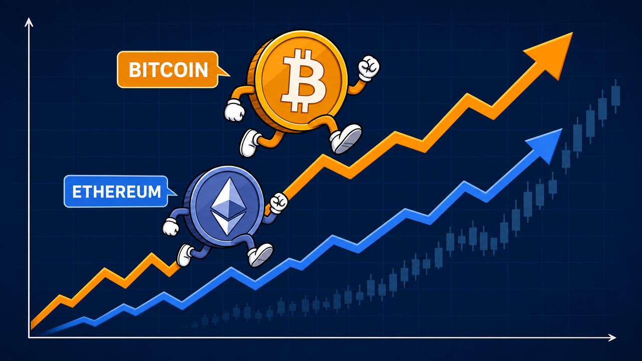
Pearson fits the questions that come up first in portfolio construction and relative value work. If you are comparing BTC returns and ETH returns, Pearson gives a direct read on whether they move together in a roughly linear way across the sample.
That makes it useful for:
The trade-off is sensitivity. One liquidation cascade or listing candle can pull the coefficient harder than you expect, especially in thinner names.
A lot of alpha research in crypto starts with variables that are not well behaved. Wallet accumulation comes in bursts. Holder growth can plateau for weeks and then jump. Smart-money participation often matters more in relative ranking than in exact magnitude.
Spearman is effective here because it evaluates rank order instead of raw values.
That matters if you are using Wallet Finder.ai to track wallet cohorts and then testing whether their activity lines up with future market behavior. In many cases, the question is not whether 4,200 net tokens bought predicts exactly 3.1 percent of next-week return. The useful question is whether higher accumulation intensity tends to coincide with better later performance than lower accumulation intensity.
I'd use Spearman for tests such as:
That is often the right framing for reproducible signal work. Wallet Finder.ai gives you the wallet-level activity. Spearman helps check whether those activity rankings have trading value before you spend time building a full feature pipeline in Python.
Kendall's Tau gets less attention in trading notebooks, but it earns its place in smaller studies and tie-heavy ranking problems. If several wallets have similar conviction scores, or several tokens share the same inflow bucket, Kendall often gives a cleaner read on agreement in ordering.
It is slower to compute, so I would not make it the default for large-scale screening across thousands of token-feature combinations. I would use it when the sample is modest and the ranking itself is the signal.
Rank-based measures often fit on-chain research better than forcing noisy wallet data into a linear framework.
What works
What doesn't
Both can help, but neither fixes bad feature design. On a real desk, the better process is simpler: choose the measure that matches the data, verify it on rolling windows, and keep only the relationships that still matter after costs, slippage, and regime changes.
Bad correlation work doesn't fail because the formula is wrong. It fails because the interpretation is sloppy.
This is the first trap and still the one that costs traders the most money. Two tokens can move together because both are reacting to the same market beta, the same listing narrative, the same liquidity cycle, or the same group of wallets rotating capital.
That doesn't mean one causes the other.
If you mistake association for cause, you'll build trades that break the moment the shared driver disappears.
A classic warning comes from Anscombe's quartet. Four different datasets can share nearly identical summary statistics, including the same correlation coefficient of 0.816, while their scatterplots look completely different, as explained in this American Scientist article on statistical correlation.
That's why I don't trust a single coefficient by itself, especially in crypto where one event can distort the whole sample.
A high number can hide a bad relationship. Always look at the plot.
Crypto time series change character. Narratives rotate. Liquidity enters and leaves. Market leaders shift. A relationship that held in one stretch can weaken or reverse later.
Common failure modes include:
That's why static full-sample correlation is only a starting point.
This one is subtle. You compute a correlation over the full dataset, find a relationship, and then act as if you could've known that structure in real time. You couldn't.
A clean research process separates what was knowable at the time from what became visible only after the sample ended.
Most weak research dies under those checks. That's a good thing. You want fragile ideas to fail in research, not in live trading.
Python makes correlation analysis easy to calculate. The hard part is choosing inputs that make trading sense.
For most market work, use percentage returns or log returns instead of raw prices. Raw prices often trend together and create misleadingly strong results.
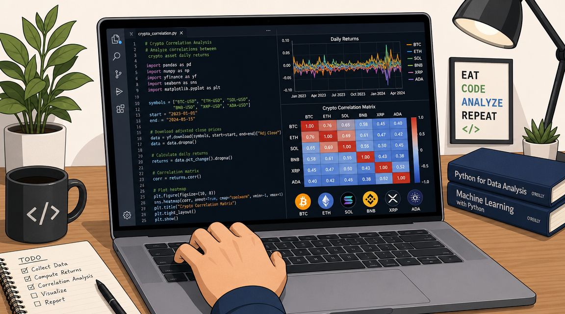
import pandas as pdimport numpy as npimport yfinance as yfimport matplotlib.pyplot as plt# Download daily price datatickers = ["BTC-USD", "ETH-USD", "SOL-USD"]prices = yf.download(tickers, start="2023-01-01", auto_adjust=True)["Close"]# Convert to daily returnsreturns = prices.pct_change().dropna()# Basic correlation matrixcorr_matrix = returns.corr(method="pearson")print("Return correlation matrix:")print(corr_matrix)
That single .corr() call gives you the baseline map of how these assets moved relative to one another over the sample.
If you're pulling token data from an API instead of Yahoo Finance, the workflow is the same. Normalize timestamps, align the data, compute returns, then correlate. If you're sourcing token market data directly, this guide to the CoinGecko API documentation for crypto data workflows is a practical reference.
Static correlation hides time variation. Rolling correlation fixes that by recalculating the relationship over a moving window.
# Rolling correlation between BTC and ETHrolling_corr = returns["BTC-USD"].rolling(window=30).corr(returns["ETH-USD"])plt.figure(figsize=(10, 5))rolling_corr.plot(title="Rolling Correlation Between BTC and ETH")plt.axhline(0, color="black", linewidth=1)plt.ylabel("Correlation")plt.show()
Desk-level insight originates here. If correlation stays high, the pair may behave like one macro trade. If it swings hard, your diversification assumptions are weak.
Here's a useful walkthrough before you code further:
A better trading question is often not “do they move together?” but “does one move first?”
# Lag ETH returns by one day and compare with SOLlagged_corr = returns["ETH-USD"].shift(1).corr(returns["SOL-USD"])print("Lagged correlation, ETH(t-1) vs SOL(t):", lagged_corr)
That simple shift tests whether yesterday's ETH move lines up with today's SOL move. You can loop through multiple lags to search for a stronger lead and lag structure.
# Test several lagsfor lag in range(1, 8):value = returns["ETH-USD"].shift(lag).corr(returns["SOL-USD"])print(f"Lag {lag}: {value}")
A reproducible workflow is simple. Clean the data, convert to returns, run baseline correlation, inspect rolling windows, then test lags. That sequence will eliminate most bad ideas before they become expensive.
A matrix full of decimals is technically correct and operationally weak. Traders spot structure faster with charts.
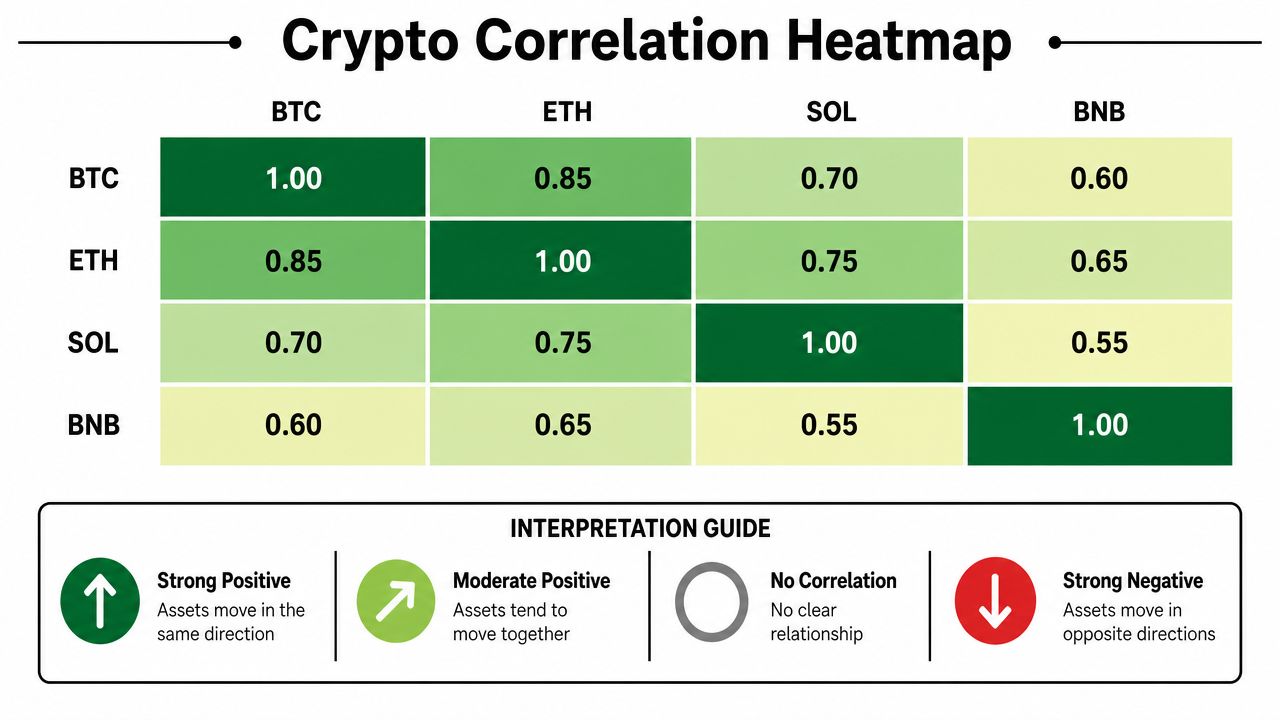
Heatmaps are the fastest way to read a portfolio's internal structure. Deep positive colors show clusters that likely share risk. Negative areas can reveal potential hedges. Neutral cells tell you where relationships are weak or unstable.
import seaborn as snsimport matplotlib.pyplot as pltplt.figure(figsize=(8, 6))sns.heatmap(corr_matrix, annot=True, cmap="RdYlGn", center=0, vmin=-1, vmax=1)plt.title("Crypto Return Correlation Heatmap")plt.show()
When I review a crypto basket, I'm looking for concentration before I'm looking for opportunity. If half the names glow the same color, you probably don't own independent bets. You own one trade expressed in several wrappers.
For a related visual approach to blockchain data, this explainer on how heatmaps visualize blockchain transactions is worth reading.
If majors, beta layer 1s, and exchange-linked tokens all sit close together, that's one cluster. You can't treat that basket as diversified just because it has several tickers.
A token with weak relationship to the rest of your book can help diversify. It can also be signaling idiosyncratic risk. The chart tells you where to investigate next.
One heatmap for the full sample is rarely enough. Run the same visualization over different rolling windows and compare. Stable clusters are useful. Clusters that appear only during one narrative burst are less reliable.
The best correlation chart doesn't impress anyone. It prevents avoidable mistakes.
Once you move beyond a small basket, a heatmap can get crowded. Network graphs solve that by turning tokens into nodes and relationships into edges.
A practical approach:
The benefit is immediate. You can see which assets form tight communities and which names act as bridges between themes.
What doesn't work is relying on one visualization and assuming the story is complete. Good charts narrow the search space. They don't replace hypothesis testing.
Manual notebooks are great for research. Live trading needs something faster. Once you move from a handful of pairs to thousands of wallets, tokens, and transaction streams, the bottleneck isn't the math. It's the data plumbing.
Price correlation is only one layer. On-chain trading opens three more practical uses.
Some wallets repeatedly enter the same themes, rotate on similar timing, or exit risk together. That can indicate shared research, common strategy templates, or influence from the same information sources.
Useful questions include:
If the pattern is consistent, that relationship can become a watchlist input.
Sometimes the signal isn't that wallets are generally similar. It's that they converge on a specific trade cluster. Several strong wallets suddenly buying related names often matters more than their long-run similarity.
That's especially useful in:
This is the familiar use case, but with more context. If two tokens move together and the same wallet cohort keeps trading both, the relationship is often more actionable than price data alone.
A trader can use that in a few ways:
The edge in crypto often comes from reaction time and coverage. Human analysts can study a few names in detail. They can't manually recompute wallet-to-wallet, token-to-token, and trade-to-trade relationships across chains all day.
That's where an on-chain workflow helps. You can inspect wallet behavior, transaction histories, and token overlap in one place instead of stitching together explorers, spreadsheets, and custom scripts. If you're evaluating whether a wallet is worth following at all, this guide on checking wallets on-chain before acting is a good operating habit.
Good correlation analysis narrows attention. Good tooling lets you act on it before the market fully prices it.
Trust repeated patterns that survive across multiple windows and make economic sense.
Challenge relationships that exist only in one burst, one wallet cluster, or one market regime. A tradable signal should be interpretable. If you can't explain why the relationship exists, you should size it small or ignore it.
Covariance tells you whether two variables move together, but its scale depends on the units of the variables. That makes it awkward for comparing different asset pairs or on-chain features.
Correlation standardizes that relationship onto a fixed scale, which is why traders usually prefer it for cross-asset comparison. If you're ranking many token pairs or wallet metrics side by side, correlation is far easier to interpret.
There isn't a universal cutoff that works for every crypto dataset. Reliability depends on the stability of the relationship, the frequency of your data, and whether the market regime stayed consistent during the sample.
The practical answer is to avoid drawing strong conclusions from short or cherry-picked windows. If a relationship only looks good in one narrow sample, assume it's fragile until it proves otherwise. I'd rather trust a weaker relationship that persists across multiple windows than a strong one that appears once and disappears.
No. Zero correlation means no linear relationship. A non-linear relationship can still exist.
That matters in crypto because some assets or wallet behaviors don't respond smoothly. They may stay disconnected most of the time, then react sharply once a threshold is crossed. If you only look at the coefficient, you can miss that structure.
A better habit is simple:
If the chart tells a different story than the coefficient, trust the mismatch enough to investigate.
Correlation analysis measures how consistently two data series move together, in opposite directions, or independently. In crypto trading, the most common applications are measuring price correlation between assets (whether BTC and ETH tend to rise and fall together), correlation between on-chain metrics and price (whether exchange inflows predict price direction), correlation between wallet behavior and subsequent price movement (whether a tracked wallet's entries consistently precede price appreciation), and lead-lag structure (whether one asset or wallet's activity tends to precede another's by a consistent interval). The output — the correlation coefficient, ranging from -1 to +1 — tells you the strength and direction of a relationship but not whether it will persist, which is why regime awareness is essential to applying the number correctly.
The data from early 2026 suggests not — at least not in the current regime. The 30-day rolling correlation between Bitcoin and the S&P 500 reached 0.74 in March 2026 and touched an intraday r-squared of 0.96 in April, meaning approximately 92% of Bitcoin's price variance was explained by equity market movements during those windows. At that correlation level, Bitcoin adds volatility to an equity-heavy portfolio without providing meaningful uncorrelated return. The structural cause is institutional adoption via spot ETFs, which has tied Bitcoin more tightly to the macro factors that drive equity prices. Whether this relationship persists depends on whether the current macro-dominated regime continues or shifts back toward crypto-specific catalysts driving price — the correlation will likely decline when that shift occurs, but predicting its timing from the coefficient alone is not reliable.
Correlation in crypto tends to rise during macro stress events and fall during crypto-specific catalysts. During a risk-off move — a sharp equity drawdown, a surprise Fed announcement, a global liquidity event — the dominant force becomes the same across all risk assets: capital preservation drives selling broadly. Assets that appear uncorrelated during calm periods can show correlations approaching 0.8 or higher during these events because the single driver (macro risk appetite) temporarily overwhelms all asset-specific factors. This regime-dependent correlation is why diversification based on calm-period correlation measurements often fails during the events it was designed to protect against. Measuring correlation separately across calm and stress periods — rather than averaging across both — gives a more honest picture of what your portfolio's actual diversification looks like when it matters most.
Lead-lag correlation measures whether one series consistently moves before another by a roughly stable interval. It matters for traders because it converts a correlation finding into a timing signal: if series A leads series B by 24 hours on average with consistent historical evidence, observing A's move gives you actionable advance information about B's likely direction. In on-chain analysis, the most useful lead-lag relationships are wallet behavior preceding price movement — wallets that consistently enter before significant appreciation create a behavioral signal with a predictable time structure that can be acted on before the price move is obvious. The interval consistency is what makes it tradeable: a wallet that sometimes leads by hours and sometimes by weeks provides weaker signal than one whose lead time is consistently in the 12 to 24 hour range.
Three tests separate a meaningful correlation from a spurious one. The first is sample size — a correlation measured across 15 observations is far more likely to reflect chance than the same correlation measured across 150 observations with similar findings. The second is out-of-sample consistency — if the correlation holds when measured on a period that was not used to identify it, that reduces the probability it is fitting specific noise in one dataset. The third is a causal mechanism — if you can identify a plausible reason why two series should be related, the correlation has a theoretical basis that makes future persistence more credible. In crypto, the most dangerous correlations are those identified in a single regime that then weaken or reverse when the regime changes — which is why checking whether a correlation has been stable across different market conditions is more valuable than knowing it was strong during any single period.
Wallet Finder.ai helps you turn raw on-chain activity into something you can trade. Use Wallet Finder.ai to track profitable wallets, inspect token overlap, monitor trade timing, and build a faster workflow for spotting correlated behavior before it becomes obvious.

A premier DeFi analytics platform empowering traders to discover and analyze profitable blockchain wallets, trades and tokens.